The purpose of this article is to help you understand:
How to build a new leads form
How to manage a lead form's settings
How to embed a lead form
Add a New Lead Form
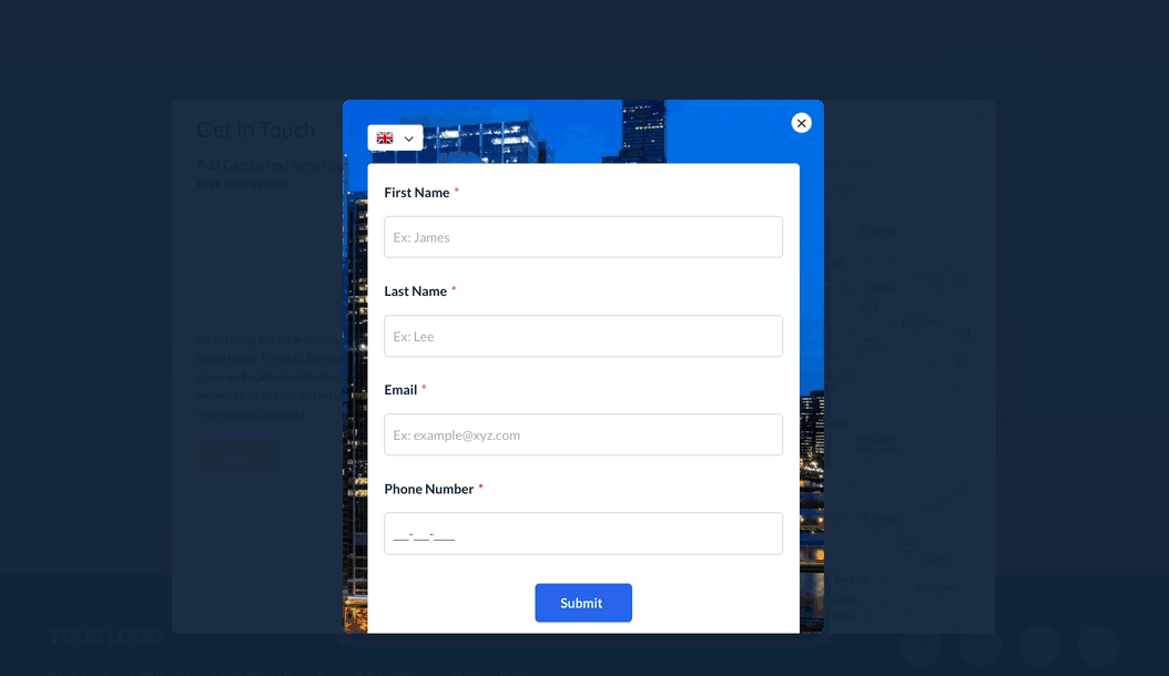
A lead form is a form that collects information from potential customers for your business.
There are six different types of options for building a new form.
Embedded form - Build an integrated form for your website, seamlessly embedding it into your web pages.
Standalone page - Generate a shareable form on a dedicated webpage, accessible through a provided link.
Pop-up box - Integrate a centrally positioned form that pops up on your webpage for user convenience.
Dropdown banner - Implement a screen-top form that descends elegantly, offering a user-friendly interaction.
Slide in left box - Add a form sliding in from the left side, enhancing user engagement seamlessly.
Slide in right box - Introduce a visually appealing form sliding in gracefully from the right side of the screen.
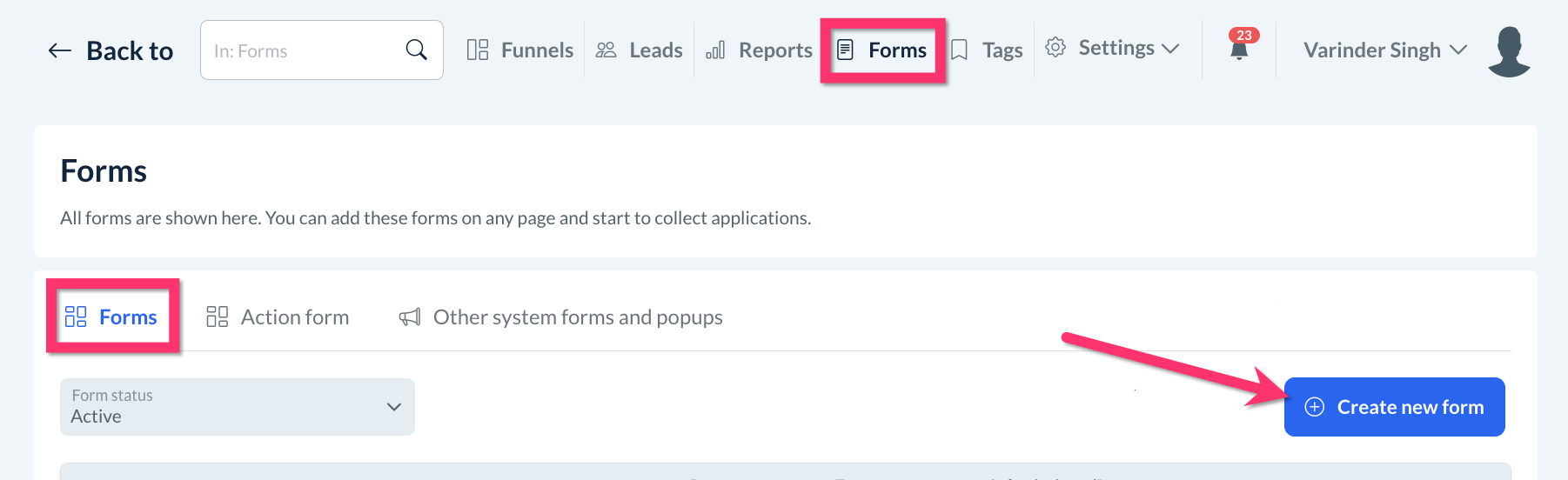
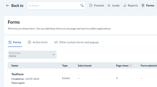
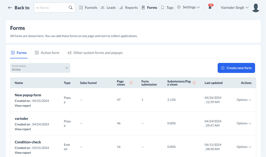
To build a new leads form, go to the Forms section at the top of the page, click on the Forms tab on the right side of the page, and then click the blue Create New button.
Next, select which type of form you would like to build.
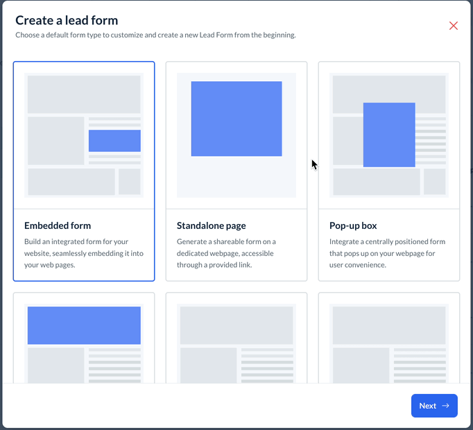
Once you've selected the form type, click the blue Next button at the bottom of the pop-up to provide a name for your form, then click Save. You will be redirected to the form builder.
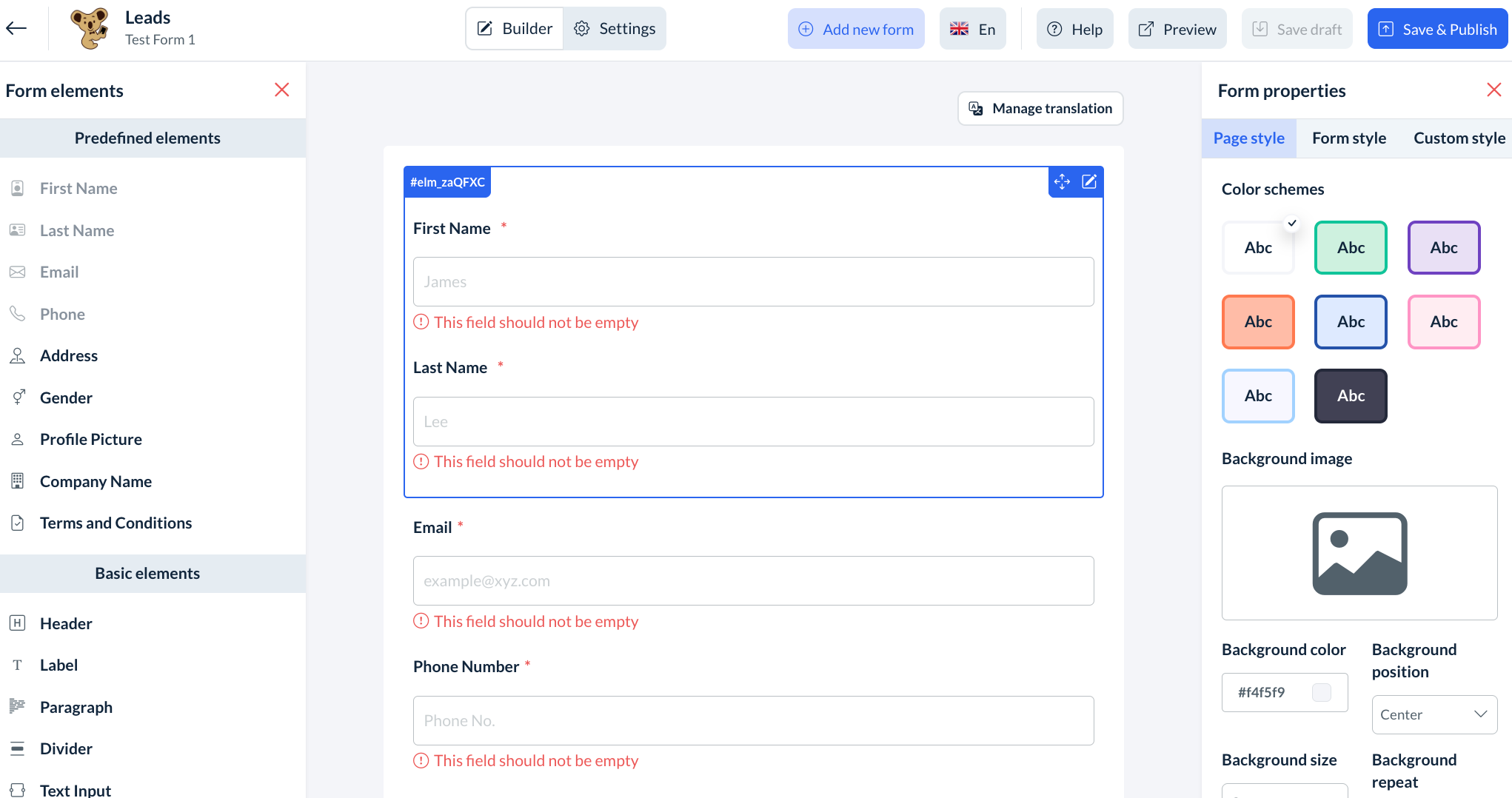
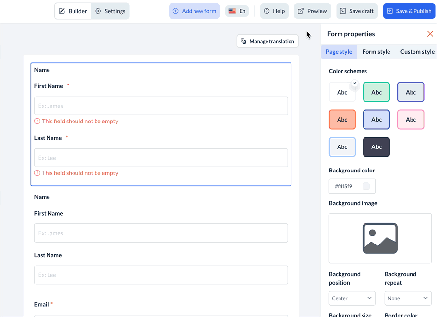
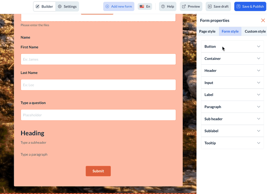
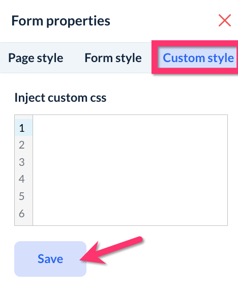
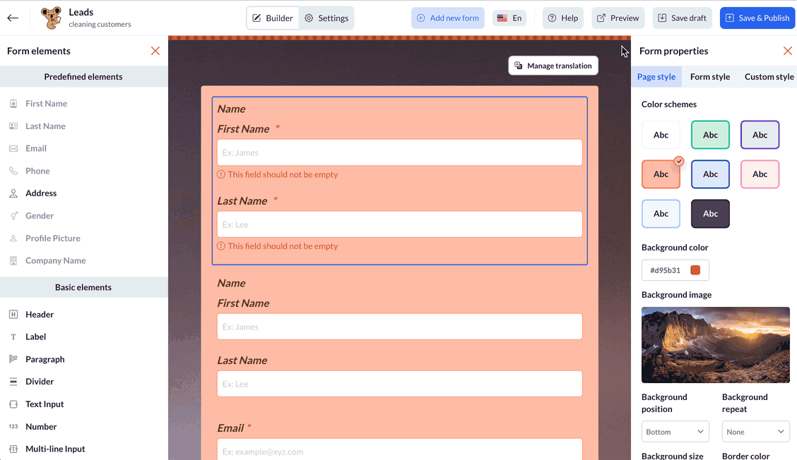
Form Properties
Along the right side column, you will see options for the page style, form style, and custom style.
The page style section contains options for the page's color schemes, background color, and/or background image.
The form style section contains options to change the color, size, and font used in the form's buttons, container, header, input, labels, paragraphs, sub-labels, and tool tips.
The custom style section contains a box where custom CSS can be entered to modify the appearance of the form. After the CSS is pasted into the box, click the blue Save button to apply the changes.
Form Elements
Predefined Elements
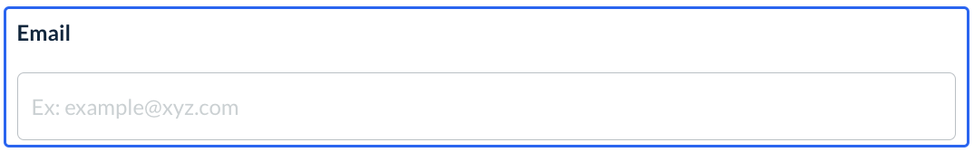
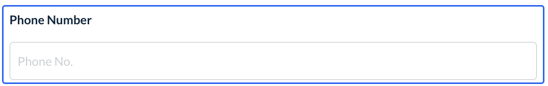
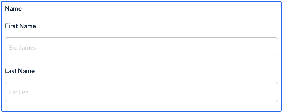
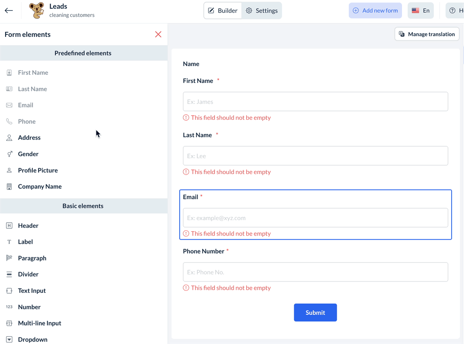
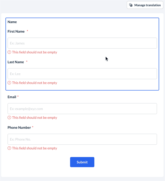
All forms require 4 pieces of information: First Name, Last Name, Email, and Phone Number. This ensures that your leads are properly linked to their profile in the Leads Dashboard. These elements are part of the 8 predefined elements that can be added to your forms. The others include:
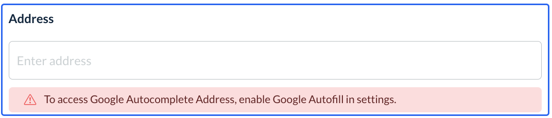
Address - Capture an address.
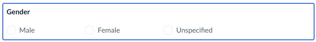
Gender - capture the lead's gender identity
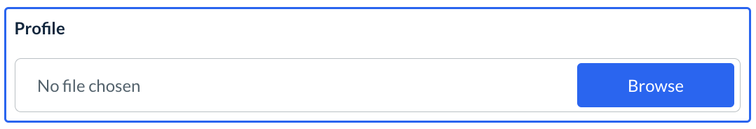
Profile Picture - capture a profile picture of the lead
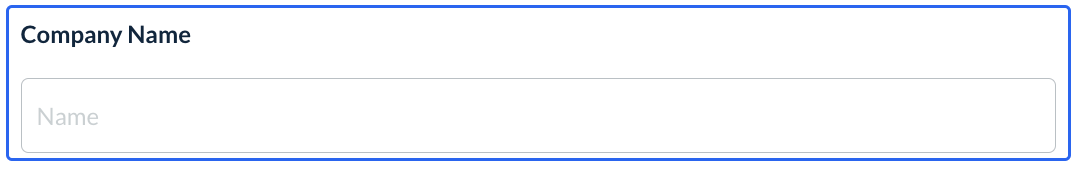
Company Name - capture the lead's company name
Terms & Conditions - capture the lead's agreement to your terms and conditions of the form
In addition to the predefined elements, there are also basic and advanced elements that can be added to the form builder.
Basic Elements
There are a variety of different Basic Elements that can be added to your form from the left-side menu.
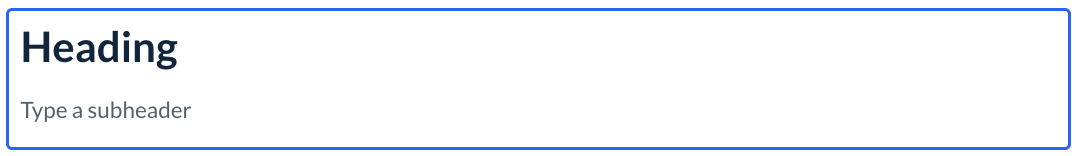
Header - Inserts a header and optional subheader
Label - Inserts a "label" style line of text

Paragraph - Inserts a "paragraph" style box of text

Divider - Inserts a divider line

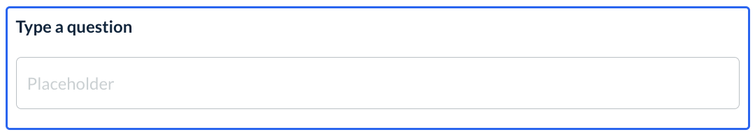
Text Input - Inserts text and a small box for text input
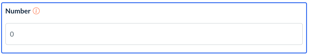
Number - Inserts text and a box for number input
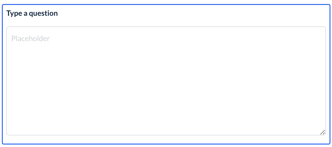
Multi-line Input - Inserts text and a large, multi-line box for text input
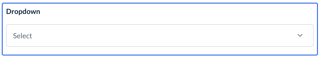
Dropdown - Inserts text and a drop-down box for input.
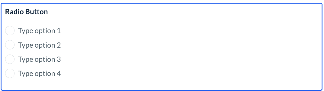
Radio Button - Inserts text and radio buttons to select one option
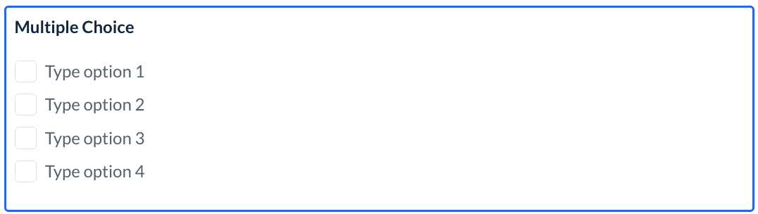
Multiple Choice - Inserts text and multiple-choice boxes to select one or more option
Advanced Elements
Below these, there are also several Advanced Elements that you can use if applicable.
Email - Insert an additional email address field
Phone - Insert an additional phone number field
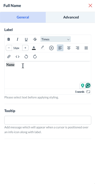
Full Name - Insert an additional name field
Address - Insert an additional address field
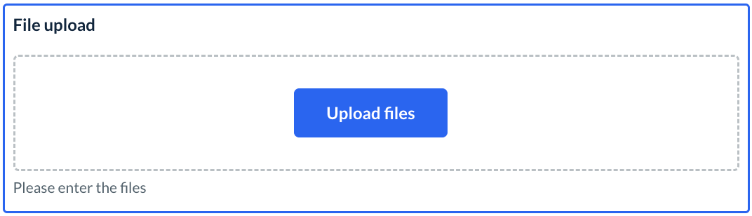
File Upload - Insert a file upload box
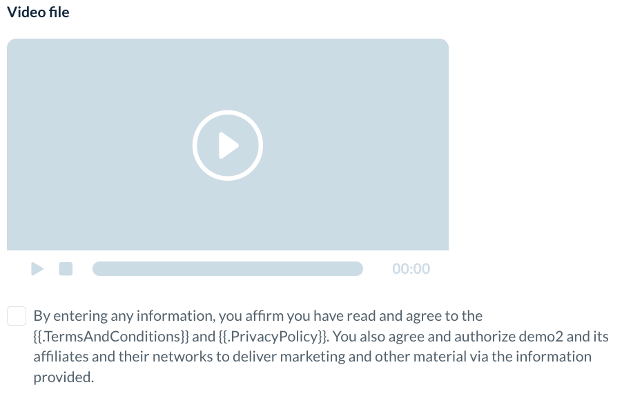
Video - Insert a video
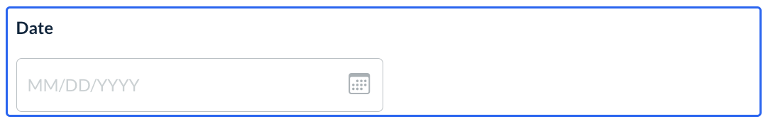
Date Picker - Insert a date box
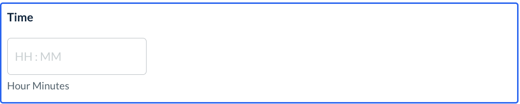
Time - Insert an hours/minutes box
Rating - Insert a rating out of 5 stars box

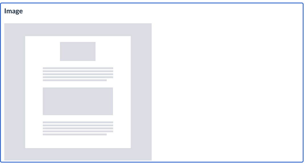
Image - Insert an image
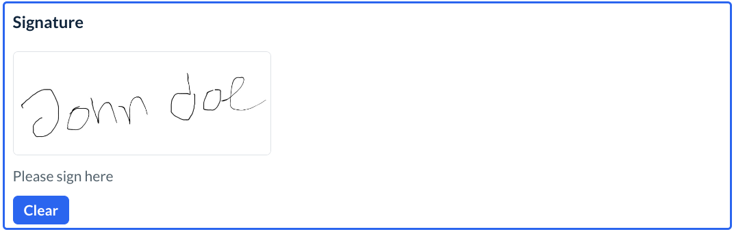
Signature - Insert a signature collected box
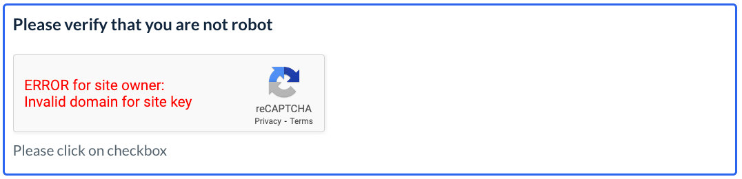
Captcha - Insert a CAPTCHA box
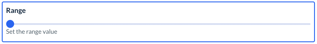
Range - Insert a range bar graphic
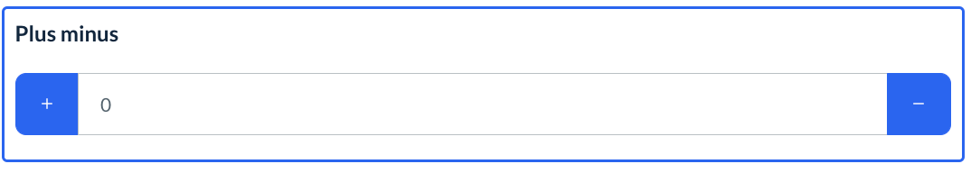
Plus/Minus - Insert a plus/minus box
Adding New Elements
To add a new element to the form, drag and drop the element name from the left side panel into the main form body.
Editing Elements
These elements can be edited by hovering over the section with your cursor and clicking the edit icon.
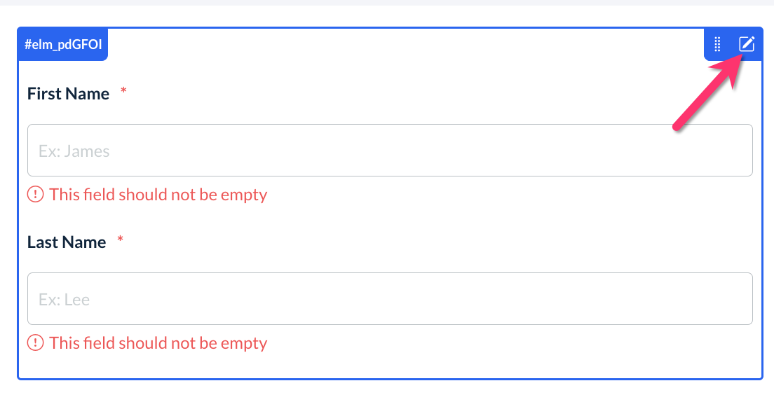
This will launch the edit options in the right-side menu.
Rearranging Elements
It is also possible to rearrange the order of elements in the form by clicking and holding the rearrange icon and dragging the element into a new position.
Archiving, Activating, and Deleting Elements
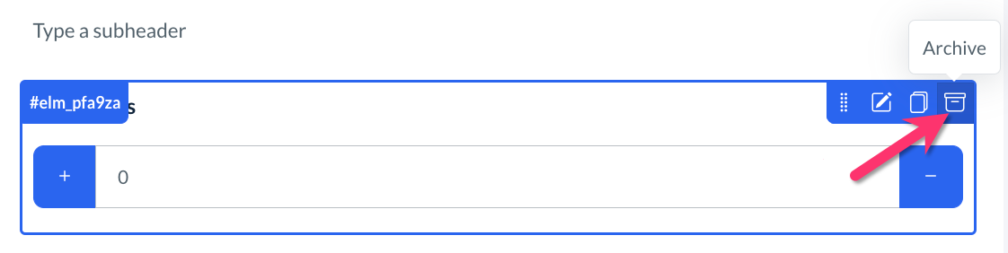
To archive or hide an element on the form, click the file box icon and select Yes to the pop-up message "Are you sure you want to archive this element?" This means that only the admin will be able to see the element when viewing the unpublished version of the form.
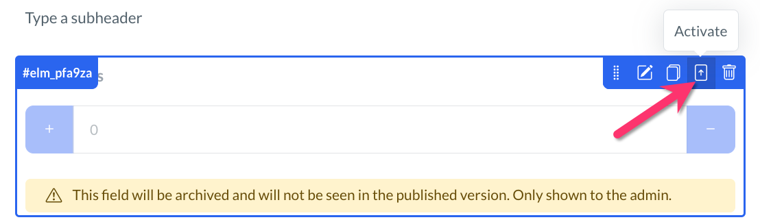
To activate an element, click on the up arrow icon in the top right corner of the action icons and select Yes to the pop-up message, "Are you sure you want to restore this element as active?"
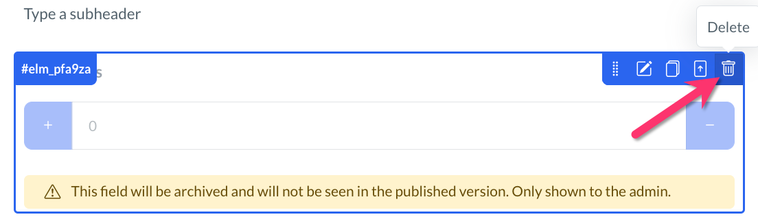
If you'd like to delete an element, you must first archive it and then you will be able to access the trash can icon used to delete elements. A pop-up will ask "Are you sure you want to delete this element?" Select the blue Delete button to proceed.
Customizing Elements
Whenever you click on one of your form's elements, the content editor will open on the right side of the screen. Depending on the type of element, there are multiple options to help customize how your quiz will function.
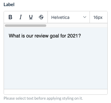
Whenever there is the option to enter text, the element menu will display a text editor box. Any writing inside the box can be formatted using word editing tools. Please be sure to highlight the text before applying a different format. The Label box will most likely contain your question.
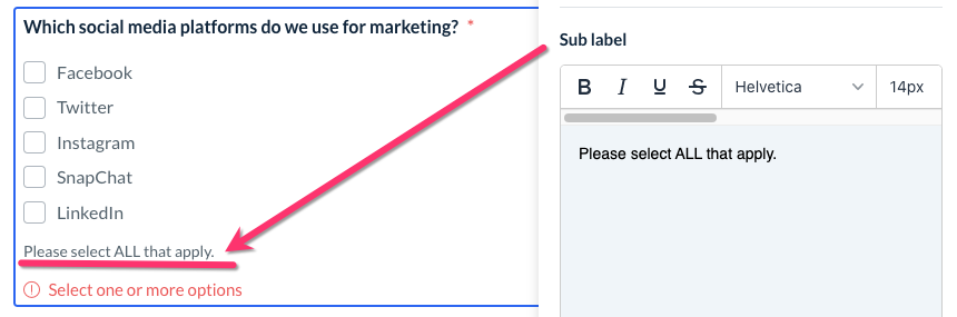
You can also add an optional Sub Label or Sub Header to many elements. This will be displayed below the answers.
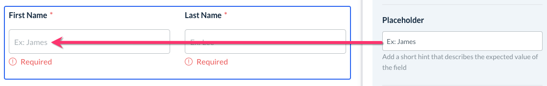
For any elements with a text input field, you can use a Placeholder to provide an example or hint of what information you are looking for.
The Address element can be formatted as a single line or Multiple Fields. You can also customize which address fields you would like to use.
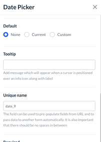
The Date Picker can be used to collect today's date, a lead's birth date, or any other date information. You can set the Default to:
None - leave the date field empty
Current - populates the field with the date the contract is submitted
Custom - set a specific date to display in the field
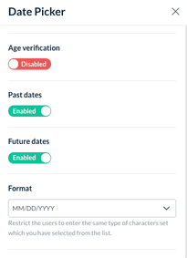
You can also enable Age Verification and set a Minimum Age to complete the form. The date options can be further restricted to just Past Dates or Future Dates, and the date Format can be customized as well.
Use the Default setting to select a default answer to select.
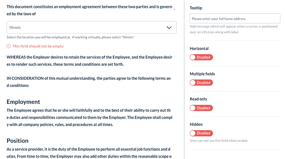
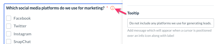
Insert a Tooltip next to the question to provide additional context or clarify the type of answer you are looking for.
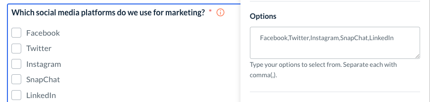
For any question that had more than one option to select, you will see an Options box. Type in each option that you'd like to display for this question, separated by commas (,).
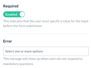
If you would like to make a question mandatory, find the Required section and toggle it to Enabled. You can also enter an Error message to display when users do not respond to mandatory questions.
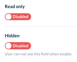
You also have the option to make a question Read Only so the user cannot select an answer, or Hidden entirely so only the admin can see it.
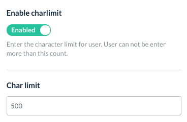
For elements that ask for a written response, click on Enable Charlimit (character limit) to limit how many characters the lead can use in their answer.
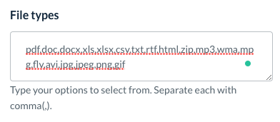
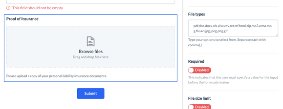
You can insert a File Upload box to collect any documents from your lead. This element can accept the following file formats: PDF, DOC, DOCX, XLS, XLXS, CSV, TXT, RTF, HTML, ZIP, MP3, WMA, MPG, FLV, AVI, JPG, JPEG, PING, and GIF. You can customize which files types can be uploaded by editing the File Types box. Please make sure that each value is separated by a comma (,) and no spaces.
The File Size Limit can also be restricted by setting a Minimum and/or Maximum size in KB. You can also enable "Multiple" for multiple files to be uploaded in this section and set a limit for the Number of Files.
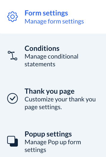
Form Settings
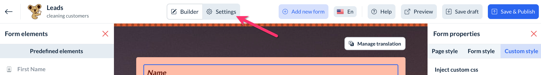
In addition to the form builder, there is also a form settings tab. To view the options, click Settings next to the Builder tab.
The Form Settings section has four tabs.
Form Settings
The Form Settings section contains several different areas to better customize how your forms behave.
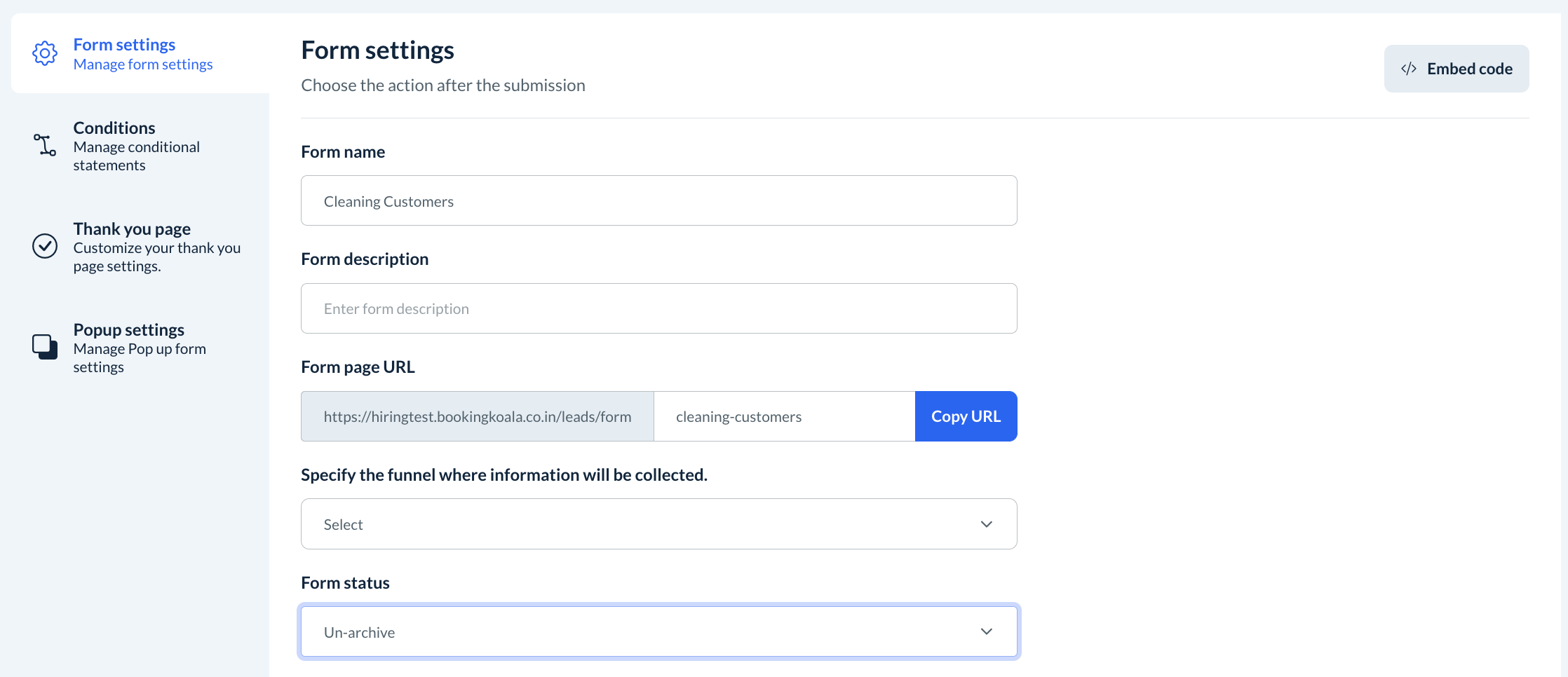
At the top of the page, you can edit your Form name, Form description, and Form page URL.
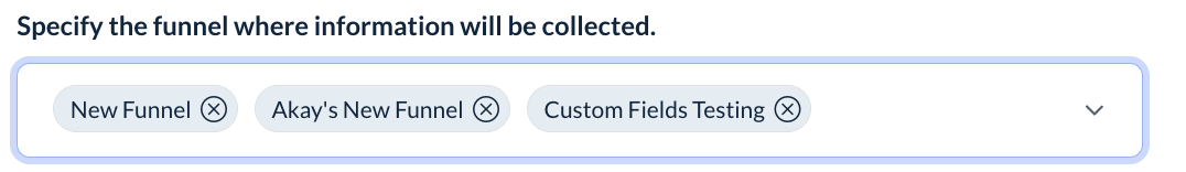
You can also specify which funnel(s) will collect information from this form.
The Form status can be switched to "Archive" if you no longer want to use this form, or "Un-archive" to make it live again.
The Google reCAPTCHA key option allows you to insert CAPTCHA boxes into your forms. You will need to generate a Google reCAPTCHA API key to set it up. Click here to learn how to generate the API key.
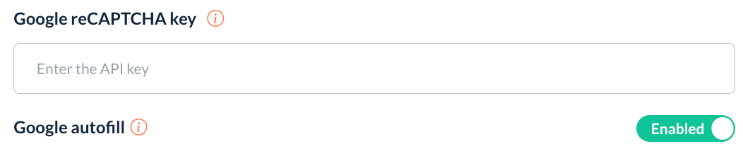
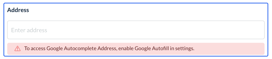
Google autofill can be enabled or disabled depending on if you would like the form to automatically suggest addresses based on previous searches and location bounds.
A Form tracking code can be entered into the box to help with your analytics.
You can also set a Default thank you message after the lead completes the form. There are options to create a Custom "thank you" message, use an External link, or select an existing "Thank you" page from another form.
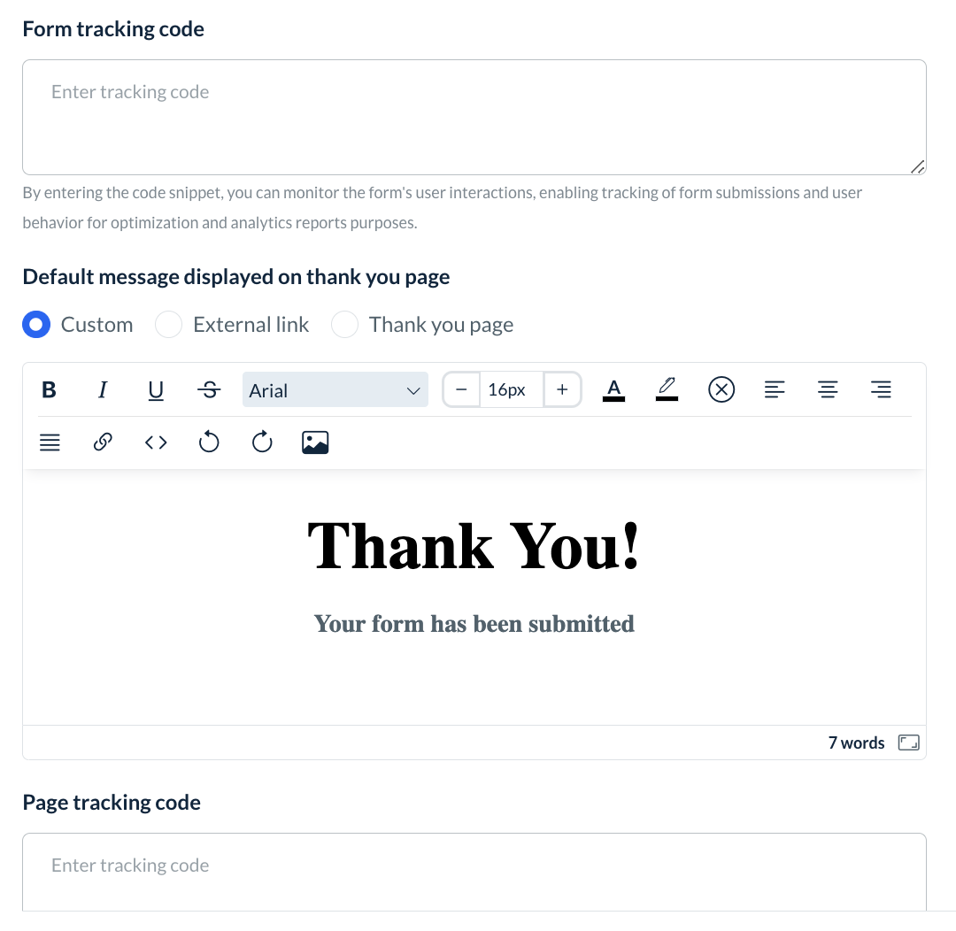
If you create a new Custom "thank you" message, you can also insert a Page Tracking Code from Facebook Pixel or Google Analytics, for example, to see who views the page.
At the bottom of the page, click the blue Save Draft button to update your draft with any changes.

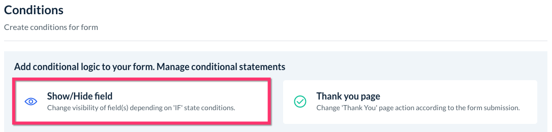
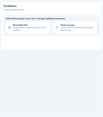
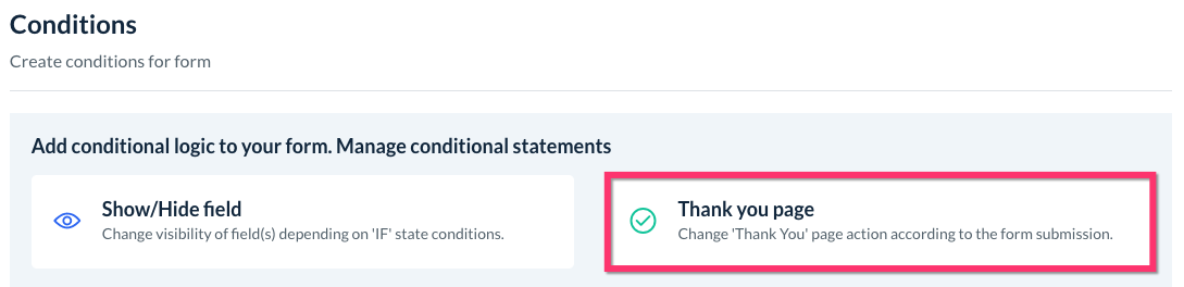
Conditions
This section controls any conditional logic inside your form.
Create A New Field Condition
Click the Show/Hide field button to add a new condition based on the input your lead enters.
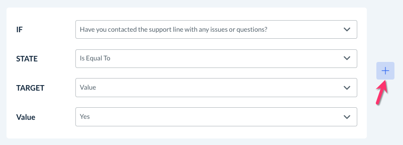
Conditions are based on "if" statements to perform a certain action depending on the input or selection made.
IF: Begin by using the drop-down menu to select the field.
STATE: Select the "state" of the field. Depending on the type of input, the options are:
Is Equal To - The action will be performed if the input is equal to the lead's answer
Is Not Equal To - The action will be performed if the input is NOT equal to the lead's answer
Contains - The action will be performed if the input contains the correct value anywhere the lead's answer
Does Not Contain - The action will be performed if the input does NOT contain the correct value anywhere the lead's answer
Starts With - The action will be performed if the beginning of the value matches the lead's answer
Doesn't Start With - The action will be performed if the beginning of the value does not match the lead's answer
Ends With - The action will be performed if the ending of the value matches the lead's answer
Doesn't End With - The action will be performed if the ending of the value does not match the lead's answer
Is Empty - The action will be performed if the input box is left empty.
Is Filled - The action will be performed if the input box is filled.
TARGET: If you are using a state that compares the input to another answer, select whether you want to use a value or another field to compare the input.
VALUE: Select a value/answer you created for this field for the comparison.
ANOTHER FIELD: Select a value/answer from a different field's value for the comparison.
DO: Select the type of action you want to occur when the condition is met.
Hide - Hide another field if the condition is met
Show - Show another field if the condition is met.
Show Multiple - Show multiple fields if the condition is met.
Hide Multiple - Hide multiple fields if the condition is met.
FIELD: Select the field(s) to show or hide.
After selecting each option, click the blue Save button to add your condition to this form.
Add Multiple IF Rules and Actions
You can also add multiple rules or actions within a condition by clicking the blue "+" icon.
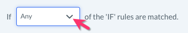
If there is more than one IF statement, you can select whether you want the actions to be performed if Any or All rules are met.
Create A New Thank You Page Condition
Click the Thank you page button to add a new condition to display a specific thank you page depending on the input submitted by the lead.
Just like with field conditions, you can select the IF, STATE, TARGET, VALUE, and FIELD boxes to set up your rule logic. Each condition can also accommodate multiple IF rules by clicking the blue "+" icon.
DO: Select the "Thank You" page action that will occur when the rules are met.
Display a custom message on submission - Create a custom message in the text post to display after the form is submitted.
Redirect to URL after submission - Enter a URL address to redirect the lead to after submitting their form.
[Existing Thank you page] - Any other "thank you" pages you have created can be selected to display.
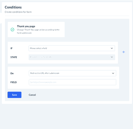
Once the logic has been set, click the blue Save button to add your new "thank you" page condition.
Where to View Existing Conditions
Every condition you create will be shown in this section as well.
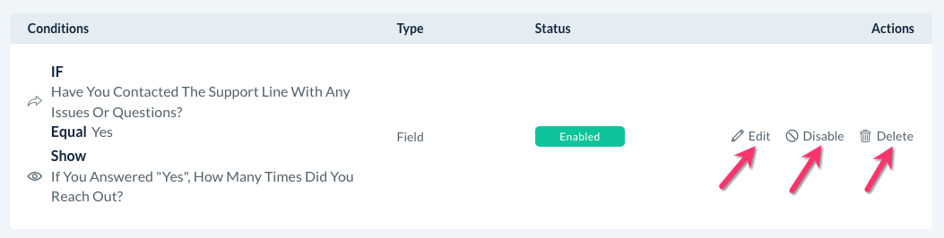
You can use the action buttons to Edit, Disable, or Delete existing conditions.
At the bottom of the page, click the blue Save Draft button to update your draft with any changes.

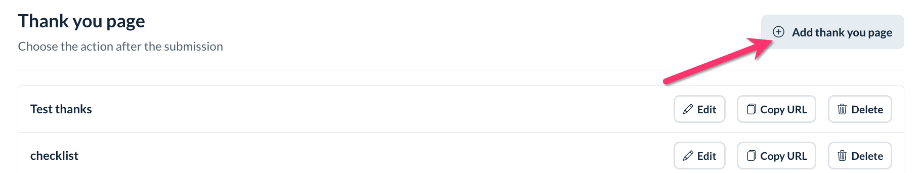
Thank You Page
The Thank You Page section of the form settings allows you to create a custom "Thank You" page to display once this form is submitted.
To add a new page, click the grey Add Thank You Page button at the top-right corner of the page.
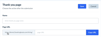
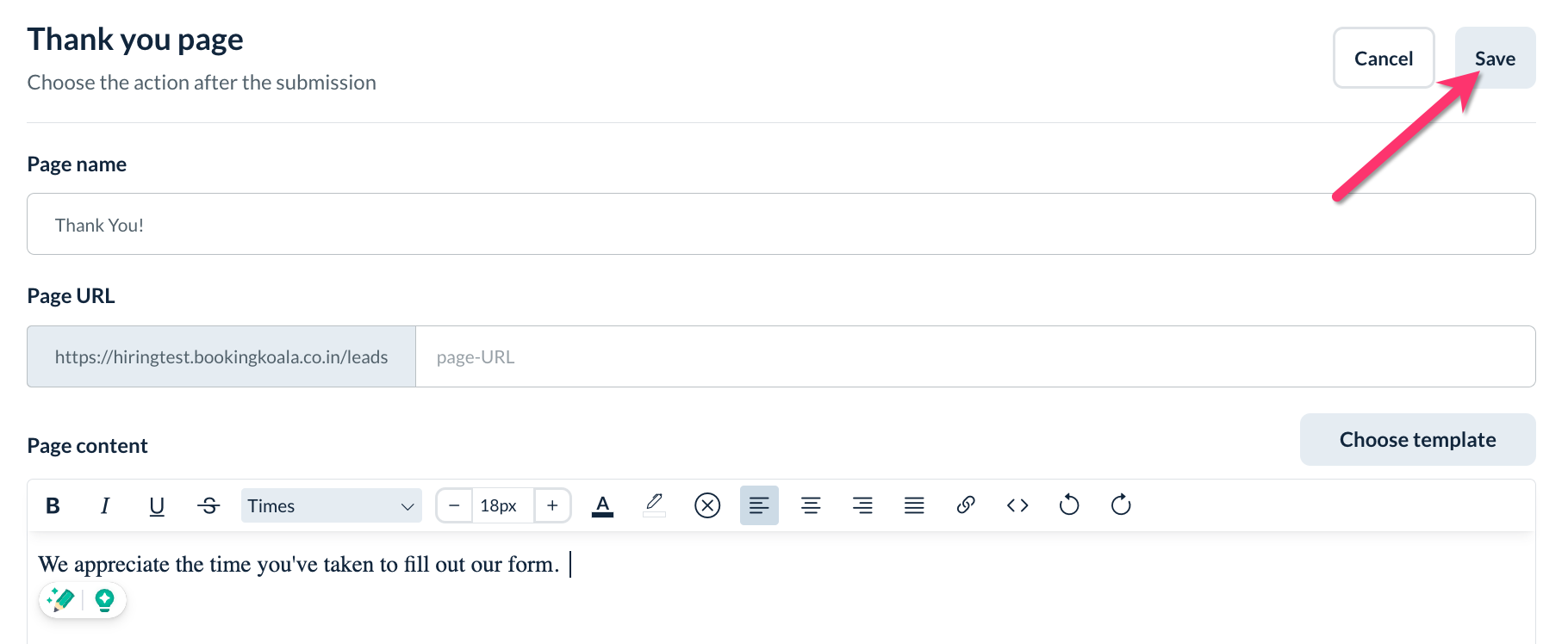
You will be brought to the "thank you" page editor. Type in a Name for your page and a Page URL will be automatically generated. You can also choose to enter your custom URL instead.
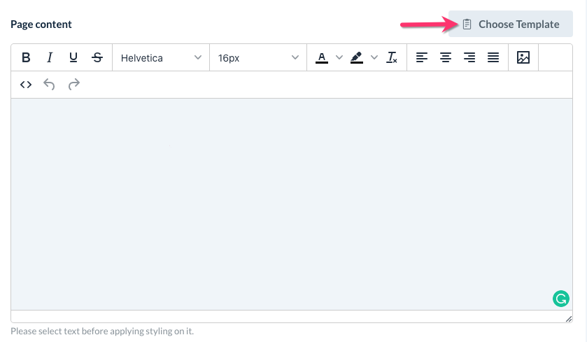
Use the text box to enter your Page content. You can also prefill the content with an existing template for a faster setup by clicking the Choose Template button.
At the bottom, you can insert a Tracking Code to see who views the page.
Once finished, click the grey Save button at the top right corner of the section to save the Thank You page.
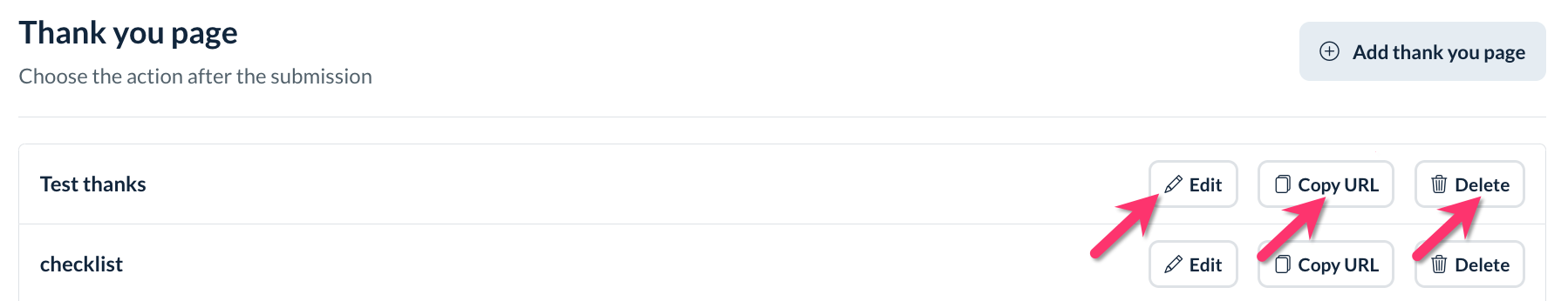
Once you have saved one or more Thank You pages, you can go back to edit, copy the URL, or delete a page from the form.
At the bottom of the page, click the blue Save Draft button to update your draft with any changes.

Popup Settings
If your form is a pop-up, there is a Popup settings section located within the form settings. This section controls under which circumstances the pop-up will be displayed.
Please note: Popup settings will only be available for the popup box, dropdown banner, slide-in left and slide-in right options/.
The first option "Automatically show pop-up on?" controls whether the pop-up is displayed on all pages or specific pages.
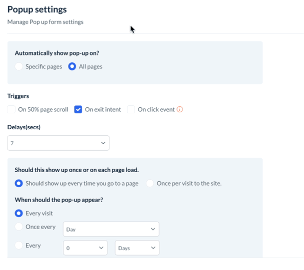
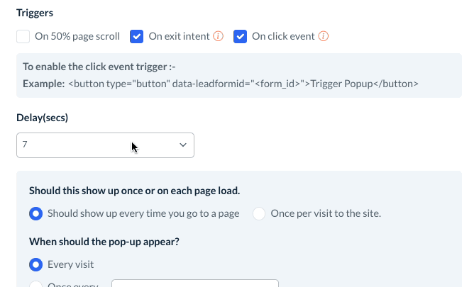
Under the Triggers section, select which triggers will be used to display the pop-up.
On 50% page scroll - Once the user scrolls down 50% or more of the page they are on.
On exit intent - The user will see the pop-up when they attempt to exit the window/tab.
On click event - The user will see the pop-up when they click a specific element. To enable this trigger, add a data attribute to your element (data-leadformid) and assign your form ID to the attribute.
Example: <button type="button" data-leadformid="<form_id>">Trigger Popup</button>
Next, set an optional delay in seconds (0 to 60).
Decide if the pop-up should show up once or on each page load.
Should show up every time you go to a page - The pop-up will be displayed every time a page is visited.
Once per visit to the site - The pop-up will only be shown the first time the lead visits the site.
If you selected to have the pop-up show every time you go to a page, there is an additional question, "When should the pop-up appear?" that allows you to select:
Every visit
Once every [day/week/month]
Every [1-100] [days/weeks/months]
At the bottom of the page, click the blue Save Draft button to update your draft with any changes.

Preview
Click Preview the form to view what the form will look like to your leads, click the Preview button near the top right corner of the page.
You can alternate between the Desktop, Tablet, and Mobile view by using the buttons in the top right corner of the page. Click Back To Form Builder to return to the editor.
Saving and Publishing Your Form
Once you are satisfied with your form, you'll want to make sure it is saved into the system.
Save Draft
Click Save Draft on the top-right corner of the builder to save a draft of your form. You can find your saved drafts at any time by going to the Forms page.
Click the drop-down menu where it says Active and select Draft Forms.
Save and Publish
If you are ready for your form to be used by leads, click the blue Save & Publish button to push it live.
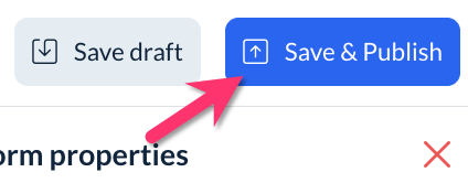
You will see a green pop-up notification in the top right corner of the page that says Form saved & published successfully.
Embedding Your Form
If you would like to embed your form onto a different website, you can easily copy the embed code from the Forms section under the Forms tab. Click on the Options button below the Actions column and select Embed Code for an active form.
A pop-up will display the full embed code for you to copy and paste into your website builder.