The purpose of this article is to help you learn:
What are hiring forms
Where to find forms in the hiring module
How to create a new form
How to add elements to a form
Where to control form settings
Publishing your form
What are hiring forms?
You can create forms in the Hiring Module for prospective candidates to fill out. Forms can be customized to collect any type of information you need throughout the hiring process.
For example, you can build a form to collect your applicant's information and qualifications before scheduling an interview. Forms could also be used to follow up with new hires to see if they have questions or feedback.
Where are the form settings?
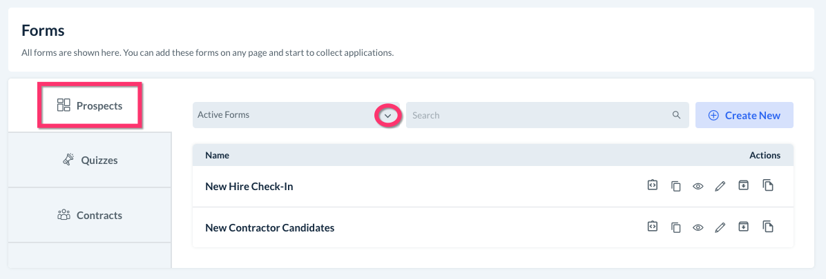
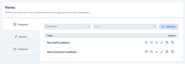
To create, edit, or delete your hiring forms, go to:
Hiring > Settings > Forms
All forms will be listed under the Prospects tab. The default view will display any active forms that are currently in use. If you'd like to view archived forms or draft forms, click the drop-down menu where it says Active Forms.
How do I create a new form?
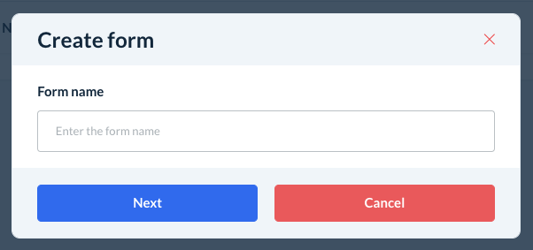
To build a new form, click the blue Create New button in the top-right corner of the Forms page.
A pop-up window will ask you to enter the form name. This can be edited later as well. Once you have entered the name, click Next to continue.
You can also add a new form directly from the Prospects section.
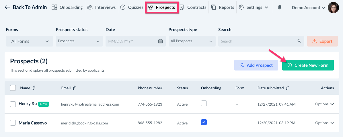
Click "Create New Form" to be brought to the form builder page.
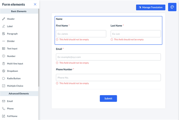
The form builder contains different types of elements that can be inserted into the form to create content. By default, every form will have the required fields for First Name, Last Name, Email, and Phone Number. This is to ensure that your prospects' forms are properly linked to their profile.
Adding New Elements
To add new elements to the form, click and drag them from the Form Elements menu on the left.
Whenever a new element is added, the element's content editor will open on the right side of the screen. This is where you can change the text and customize the content within the element.
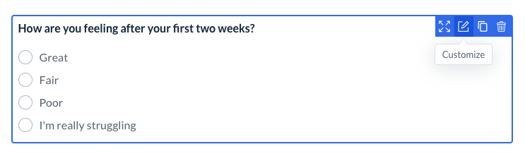
To reorder, hover over the element to review the blue action buttons. Click and hold the first button, Drag to Reorder, and drag the section up or down to reposition it.
The second action button, Customize, will reopen the content editor on the right side of the page.
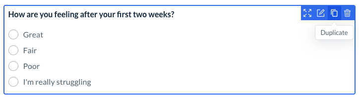
The third button, Duplicate, allows you to make a copy of the element you have selected.

The fourth button, Delete, will delete the entire element from the form.
Basic Elements
There are a variety of different Basic Elements that can be added to your form from the left-side menu.
Header - Inserts a header and optional subheader
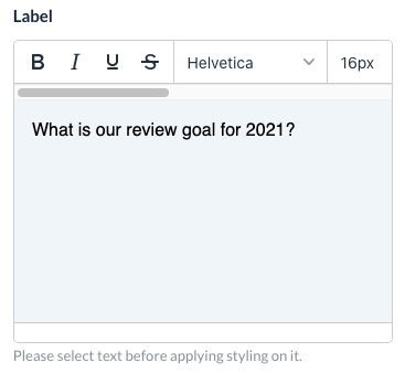
Label - Inserts a "label" style line of text
Paragraph - Inserts a "paragraph" style box of text
Divider - Inserts a divider line
Text Input - Inserts text and a small box for text input
Number - Inserts text and a box for number input
Multi-line Input - Inserts text and a large, multi-line box for text input
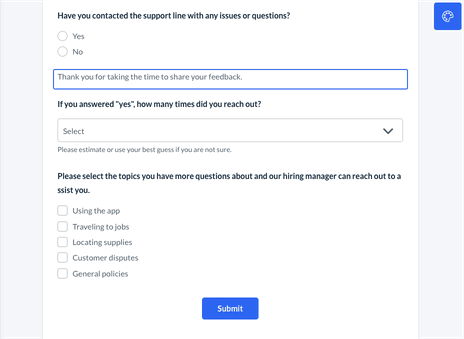
Dropdown - Inserts text and a drop-down box for input.
Radio Button - Inserts text and radio buttons to select one option
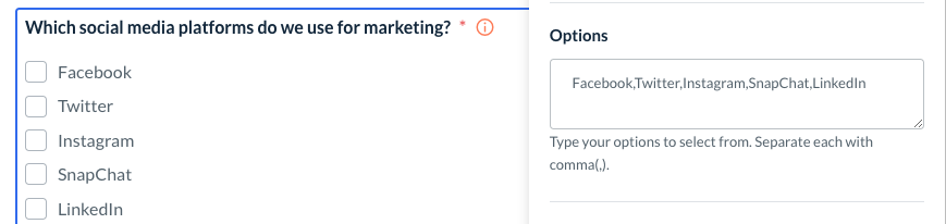
Multiple Choice - Inserts text and multiple-choice boxes to select one or more option
Advanced Elements
Below these, there are also several Advanced Elements that you can use if applicable.
Email - Insert an additional email address field
Phone - Insert an additional phone number field
Full Name - Insert an additional name field
Address - Insert an address field
File Upload - Insert a file upload box
Date Picker - Insert a date box
Time - Insert an hours/minutes box
Rating - Insert a rating out of 5 stars box
Image - Insert an image
Signature - Insert a signature collected box
Range - Insert a range bar graphic
Captcha - Insert a CAPTCHA box
Customizing Elements
Whenever you click on one of your quiz's elements, the content editor will open on the right side of the screen. Depending on the type of element, there are multiple options to help customize how your quiz will function.
Whenever there is the option to enter text, the element menu will display a text editor box. Any writing inside the box can be formatted using word editing tools. Please be sure to highlight the text before applying a different format. The Label box will most likely contain your question.
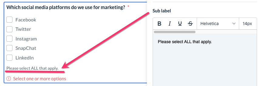
You can also add an optional Sub Label or Sub Header to many elements. This will be displayed below the answers.
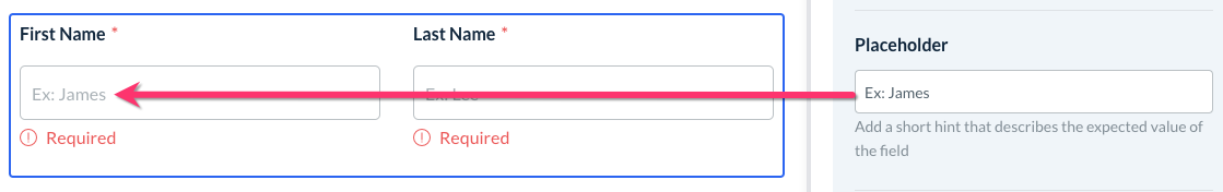
For any elements with a text input field, you can use a Placeholder to provide an example or hint of what information you are looking for.
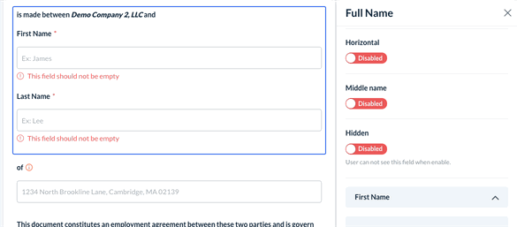
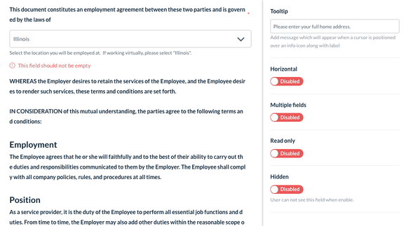
The Full Name element has multiple options to change the formatting. You can enable a middle name field and format the boxes to display Horizontally and in Columns.
The Address element can be formatted as a single line or Multiple Fields. You can also customize which address fields you would like to use.
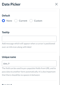
The Date Picker can be used to collect today's date, a prospect's birth date, or any other date information. You can set the Default to:
None - leave the date field empty
Current - populates the field with the date the contract is submitted
Custom - set a specific date to display in the field
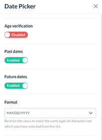
You can also enable Age Verification and set a Minimum Age to complete the contract. The date options can be further restricted to just Past Dates or Future Dates, and the date Format can be customized as well.
Use the Default setting to select a default answer to select.
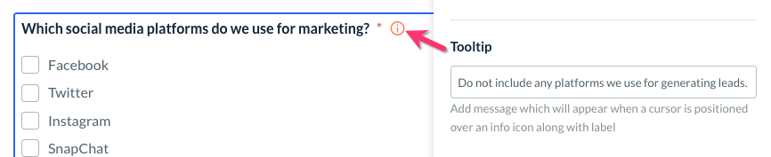
Insert a Tooltip next to the question to provide additional context or clarify the type of answer you are looking for.
For any question that had more than one option to select, you will see an Options box. Type in each option that you'd like to display for this question, separated by commas (,).
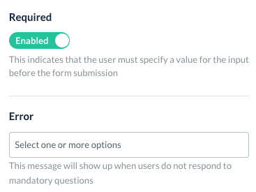
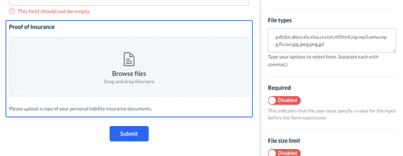
If you would like to make a question mandatory, find the Required section and toggle it to Enabled. You can also enter an Error message to display when users do not respond to mandatory questions.
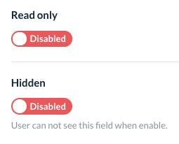
You also have the option to make a question Read Only so the user cannot select an answer, or Hidden entirely so only the admin can see it.
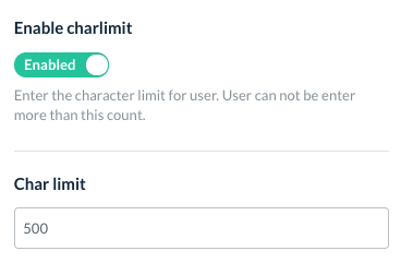
For elements that ask for a written response, click on Enable Charlimit (character limit) to limit how many characters the prospect can use in their answer.
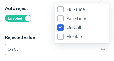
If you would like your form to Auto Reject a form based on a specific response, click the toggle button to enable and select which value(s) will result in an automatic rejection of the form.
For more information about auto-reject in quizzes and forms, click here.
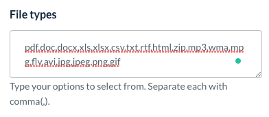
You can insert a File Upload box to collect any documents from your prospect. This element can accept the following file formats: PDF, DOC, DOCX, XLS, XLXS, CSV, TXT, RTF, HTML, ZIP, MP3, WMA, MPG, FLV, AVI, JPG, JPEG, PING, and GIF. You can customize which file types can be uploaded by editing the File Types box. Please make sure that each value is separated by a comma (,) and no spaces.
The File Size Limit can also be restricted by setting a Minimum and/or Maximum size in KB. You can also enable "Multiple" for multiple files to be uploaded in this section and set a limit for the Number of Files.
Form Settings
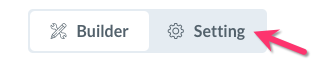
In addition to the form builder, there is also a form settings tab. To view the options, click Setting next to the Builder tab.
The Form Settings section has three tabs.
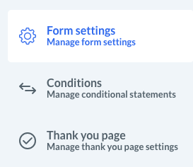
Form Settings
The Form Settings section contains several different areas to better customize how your forms behave.
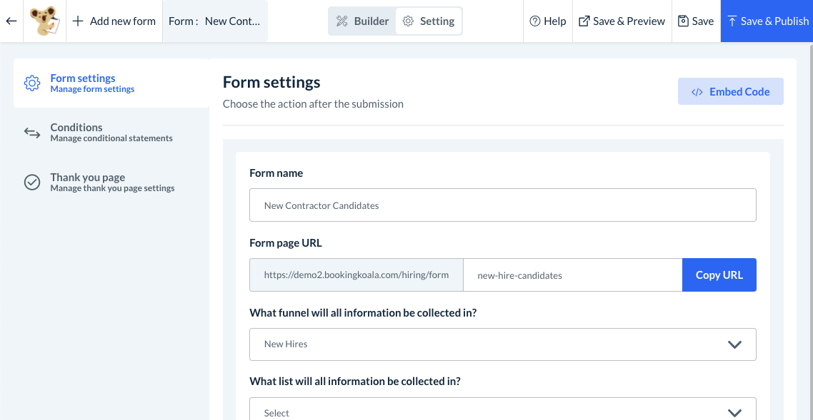
At the top of the page, you can edit your Form name and Form page URL.
You can also select which funnel will collect new submissions from this from under the question, "What funnel will all information be collected in?" This means if you have embedded the form on your site or sent a link to a prospect, that prospect will be automatically added to the selected funnel once the form is filled out.
You can also select an audience list to collect the email addresses of all submitted forms. Click the box beneath "What list will all information be collected in?" to choose the desired audience.
The Form status can be switched to "Archive" if you no longer want to use this form, or "Un-archive" to make it live again.
The Google reCAPTCHA key option allows you to insert CAPTCHA boxes into your forms. You will need to generate a Google reCAPTCHA API key to set it up. Click here to learn how to general the API key.
A Form tracking code can be entered into the box to help with your analytics.
You can also set a Default thank you message for after the prospect completes the form. There are options to create a Custom "thank you" message, use an External link, or select an existing "Thank you" page from another form.
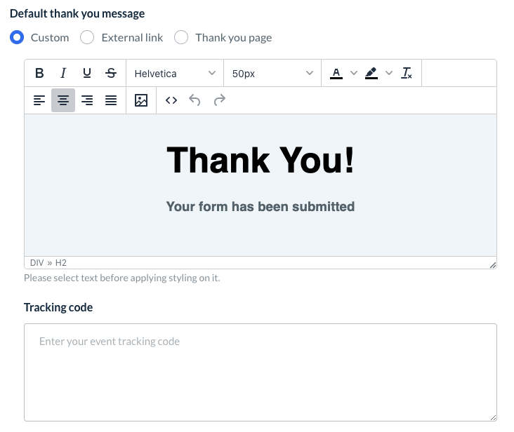
If you create a new Custom "thank you" message, you can also insert a Tracking Code from Facebook Pixel or Google Analytics, for example, to see who views the page.
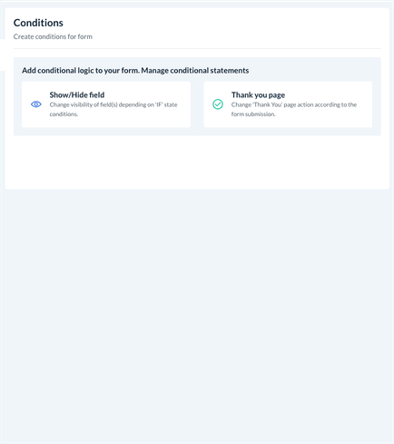
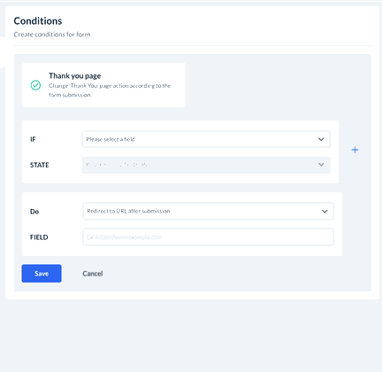
Conditions
This section controls any conditional logic inside your form.
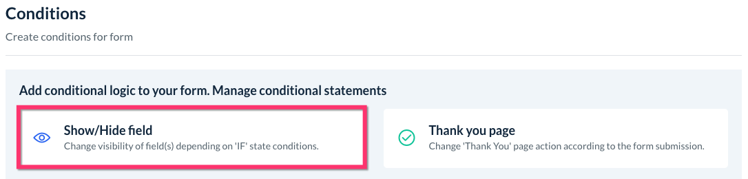
Create A New Field Condition
Click the Show/Hide field button to add a new condition based on the input your prospect enters.
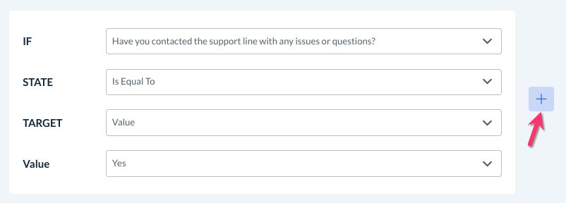
Conditions are based on "if" statements to perform a certain action depending on the input or selection made.
IF: Begin by using the drop-down menu to select the field.
STATE: Select the "state" of the field. Depending on the type of input, the options are:
Is Equal To - The action will be performed if the input is equal to the prospect's answer
Is Not Equal To - The action will be performed if the input is NOT equal to the prospect's answer
Contains - The action will be performed if the input contains the correct value anywhere the prospect's answer
Does Not Contain - The action will be performed if the input does NOT contain the correct value anywhere the prospect's answer
Starts With - The action will be performed if the beginning of the value matches the prospect's answer
Doesn't Start With - The action will be performed if the beginning of the value does not match the prospect's answer
Ends With - The action will be performed if the ending of the value matches the prospect's answer
Doesn't End With - The action will be performed if the ending of the value does not match the prospect's answer
Is Empty - The action will be performed if the input box is left empty.
Is Filled - The action will be performed if the input box is filled.
TARGET: If you are using a state that compares the input to another answer, select whether you want to use a value or another field to compare the input.
VALUE: Select a value/answer you created for this field for the comparison.
ANOTHER FIELD: Select a value/answer from a different field's value for the comparison.
DO: Select the type of action you want to occur when the condition is met.
Hide - Hide another field if the condition is met
Show - Show another field if the condition is met.
Show Multiple - Show multiple fields if the condition is met.
Hide Multiple - Hide multiple fields if the condition is met.
FIELD: Select the field(s) to show or hide.
After selecting each option, click the blue Save button to add your condition to this form.
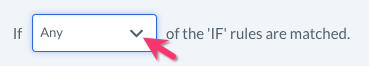
Add Multiple IF Rules and Actions
You can also add multiple rules or actions within a condition by clicking the blue "+" icon.
If there is more than one IF statement, you can select whether you want the actions to be performed if Any or All rules are met.
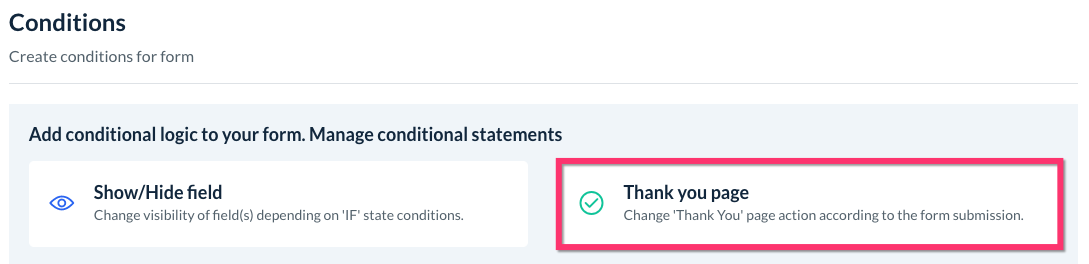
Create A New Thank You Page Condition
Click the Thank You page button to add a new condition to display a specific thank you page depending on the input submitted by the prospect.
Just like with field conditions, you can select the IF, STATE, TARGET, VALUE, and FIELD boxes to set up your rule logic. Each condition can also accommodate multiple IF rules by clicking the blue "+" icon.
DO: Select the "Thank You" page action that will occur when the rules are met.
Display a custom message on submission - Create a custom message in the text post to display after the form is submitted.
Redirect to URL after submission - Enter a URL address to redirect the prospect to after submitting their form.
[Existing Thank you page] - Any other "thank you" pages you have created can be selected to display.
Once the logic has been set, click the blue Save button to add your new "thank you" page condition.
Where to View Existing Conditions
Every condition you create will be shown in this section as well.
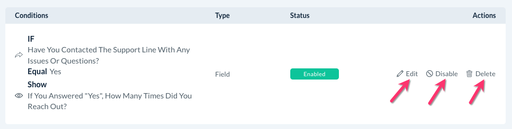
You can use the action buttons to Edit, Disable, or Delete existing conditions.
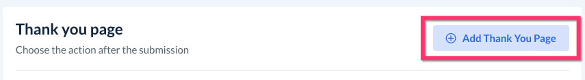
Thank You Page
The Thank You Page section of the form settings allows you to create a custom "Thank You" page to display once this form is submitted.
To add a new page, click the blue Add Thank You Page button at the top-right corner of the page.
You will be brought to the "thank you" page editor. Type in a Name for your page and a Page URL will be automatically generated. You can also choose to enter your custom URL instead.
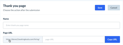
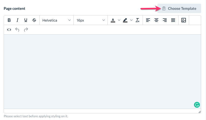
Use the text box to enter your Page content. You can also prefill the content with an existing template for a faster setup by clicking the Choose Template button.
At the bottom, you can insert a Tracking Code to see who views the page.
Saving and Publishing Your Form
Once you are satisfied with your form, you'll want to make sure it is saved into the system.
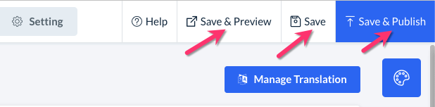
Save
Click Save on the top-right corner of the builder to save a draft of your form. You can find your saved drafts at any time by going to:
Hiring > Settings> Forms > Prospects
Click the drop-down menu where it says Active Forms and select Draft Forms.
Save and Preview
Click Save and Preview to save as a draft and view what the form will look like to your prospects.
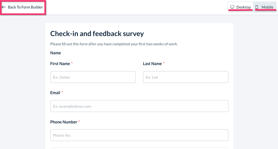
You can alternate between the Desktop view and Mobile view by using the buttons in the top right corner of the page. Click Back To Form Builder to return to the editor.
Save and Publish
If you are ready for your form to be used by prospects, click the blue Save & Publish button to push it live. You will see a green pop-up notification in the top right corner of the page that says Form saved & published successfully.
Now, the form is ready to be sent to your hiring prospects. To learn how to send out a form, click here.