The purpose of this article is to help you learn how to:
Create a new checklist
Add tasks and subtasks to the checklist
Set up each type of checklist element
What are checklists?
In Bookingkoala, "Checklists" are interactive lists of duties associated with particular services or bookings. Providers, staff, and admin can use checklists to add media, log details, send notes, and complete tasks.
If customers are permitted to see checklists, they can also send checklist notes to the admin and view the "Checklist Progress" page for the booking.
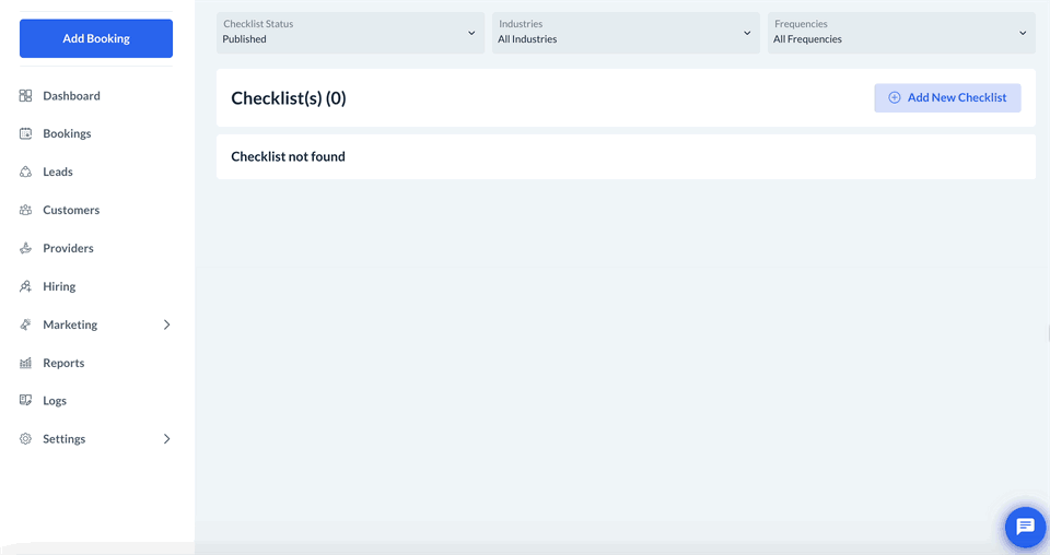
Admin and staff (with permission) can utilize the "Checklist Builder" in the admin checklist dashboard to build and manage checklists for different services, industries, and customers.

The "Checklist Builder" is used to create new checklists by adding one or more tasks and subtasks to the list. "Tasks" are used to describe broader categories or aspects of the service, while "subtasks" are used to describe specific steps or duties that must be addressed to complete the main task.
How to Build a Checklist
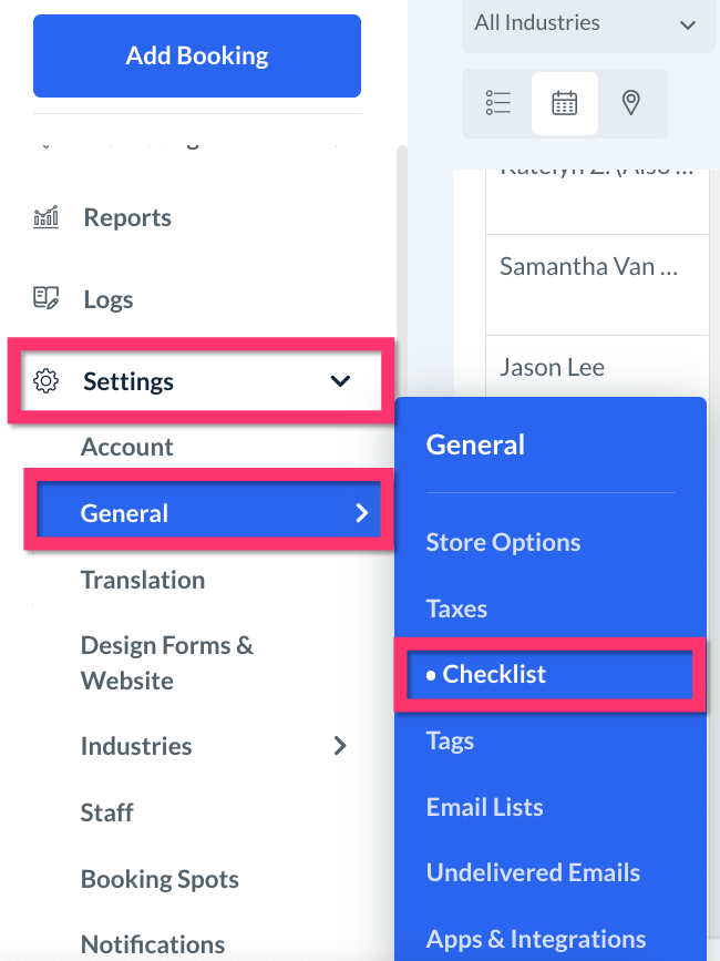
You can create and manage all of your business's checklists inside the Checklist Module from the left-side menu in the admin dashboard under:
Settings > General > Checklist
Add a New Checklist
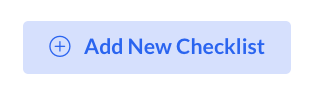
To create a new checklist, click on the blue "Add New Checklist" button near the top-right corner of the page.
Use the "+ Blank Template" button to begin with an empty checklist, or select a default checklist template and then click "Next" to customize it.
Enter a name for the checklist in the "Enter Name" field and click the "Save" button to create the new list, or click "Back to templates" if you'd prefer to select a default template instead.
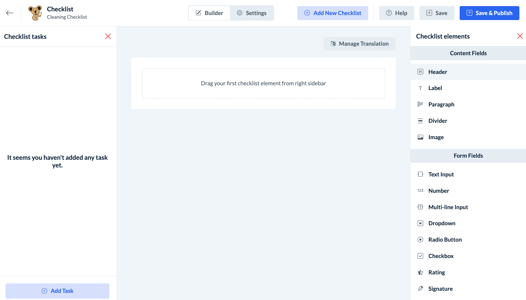
Once the checklist name has been saved, you will be redirected to the checklist builder.
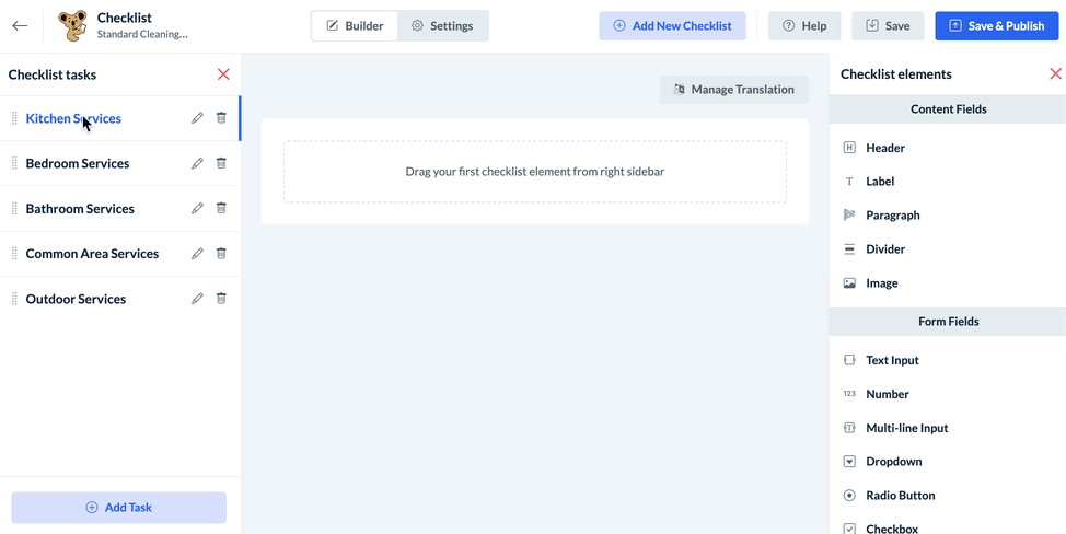
Checklist Tasks and Subtasks
Once a new checklist has been generated, the next step is to add "tasks" for the service. Each task represents a different section or category of the services being offered in the checklist. Tasks can be expanded upon by adding "subtasks".
For example, a cleaning company may have a checklist with the following tasks:
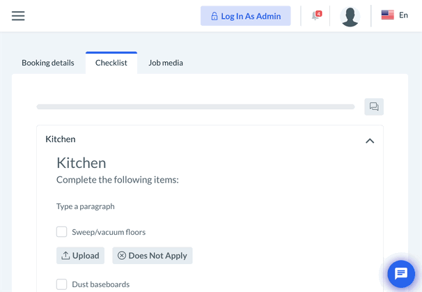
Kitchen
Bedroom
Bathroom
Common Areas
Outdoor Spaces
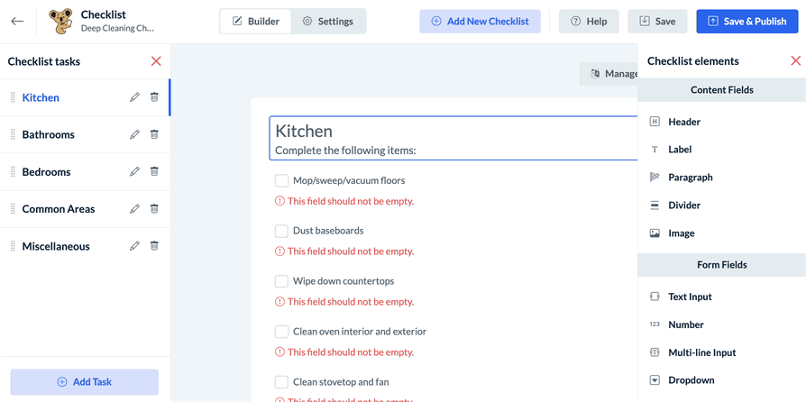
The company can then include more specific areas and services under the "Kitchen Services" task in the form of subtasks. For example:
Wash dishes
Clean backsplash and sink
Wipe countertops
Clean stovetop and stove fan
Clean inside oven
Clean fridge top and exterior
Clean inside fridge
Clean inside freezer (if thawed)
Sweep and mop floors
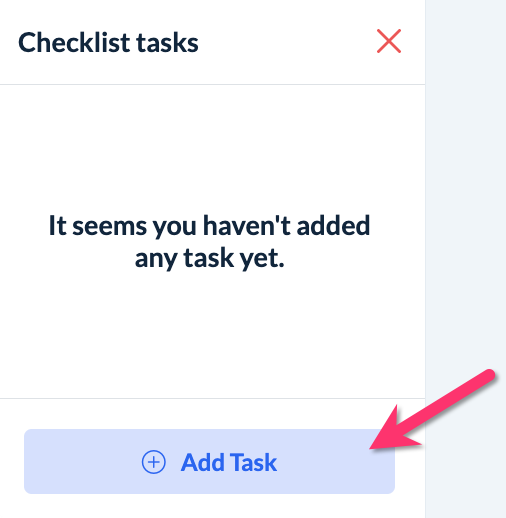
Add a New Task
To add a new task to the checklist, click the blue "Add Task" button on the bottom of the left-side menu.
Enter the name of the task into the topmost field in the "Add task" pop-up window.
Check the box next to "Enable task submission" to allow providers and teams to complete all subtasks in this task by completing the main task. When this option is not enabled, providers will first need to complete the individual subtasks before the main task can be completed.
Click "Cancel" to return to the Checklist Builder without adding a new task or "Save" to add the task to this checklist.
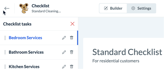
Change the Task Order
If the checklist has more than one task, you can change the task order by holding the "drag to reorder" icon to the left of the task's name and dragging it up or down the list.
A green system alert will appear in the top-right corner confirming that the task priority has been updated.
Edit or Delete a Task
To edit an existing task, click the pencil icon to the right of the task name to open the "Update Task" pop-up.
Once you are finished, click the blue "Update" button to save any changes. A green system alert will appear in the top-right corner confirming that the task has been updated successfully.
If you would like to permanently delete a task, click the trash icon to the right of the task name and select "Delete" in the following pop-up window.

Deleting a task will also delete any subtasks and checklist elements added under that task, so please be sure you are ready to proceed before clicking "Delete".
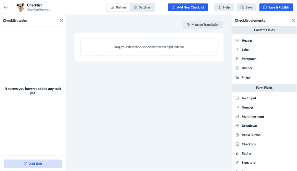
Add a New Subtask
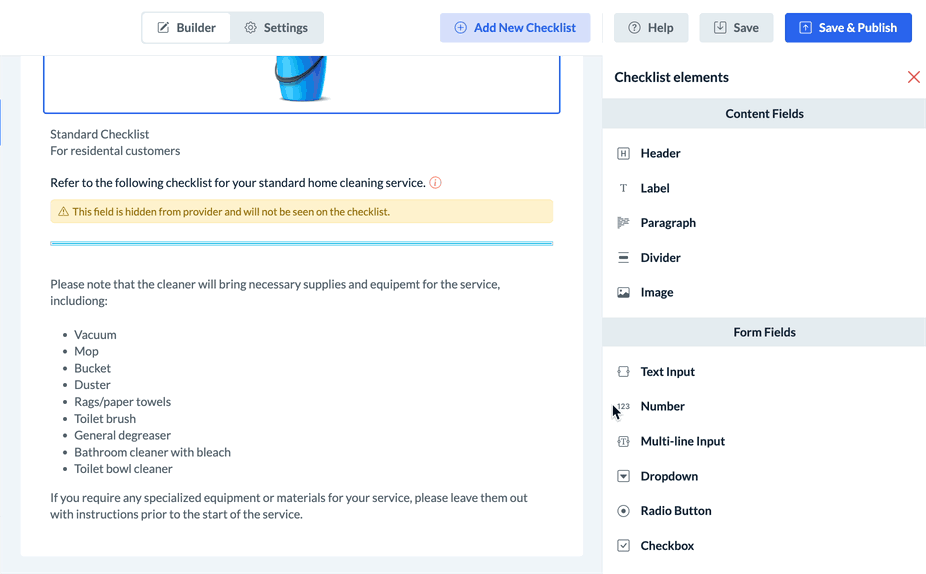
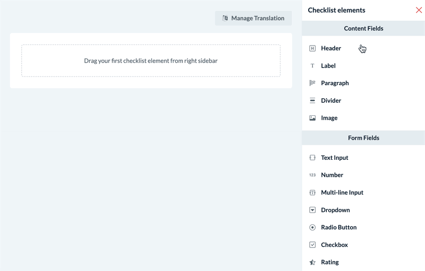
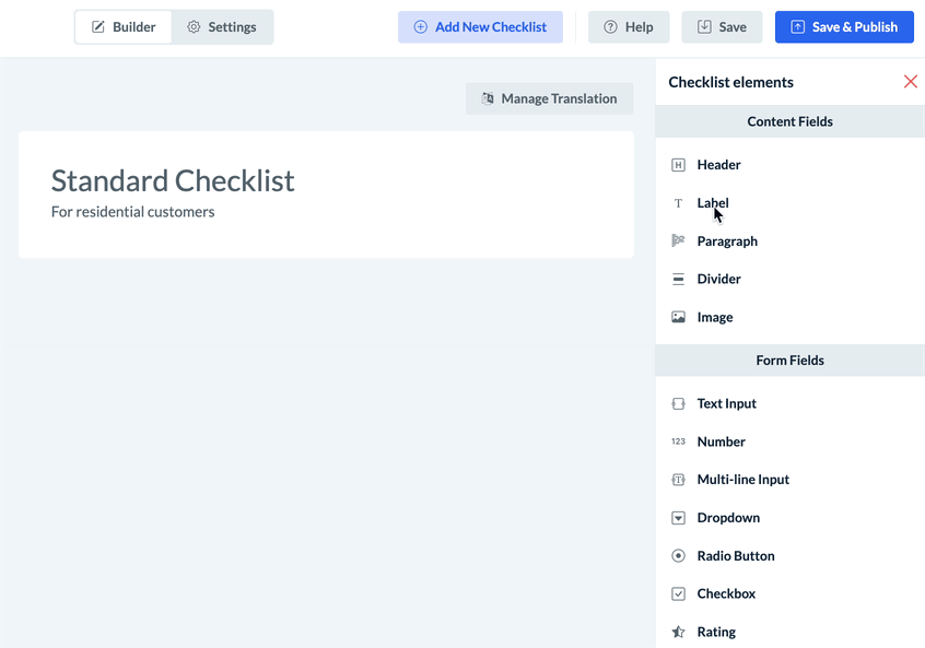
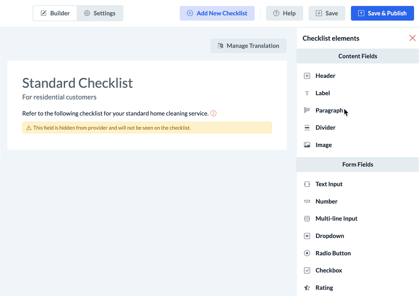
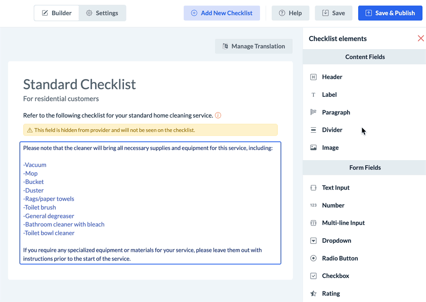
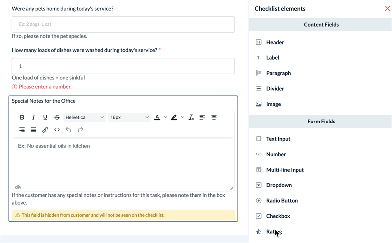
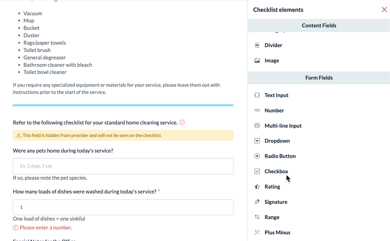
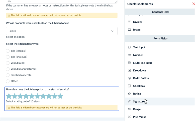
Once one or more tasks have been added to a checklist, you will be able to add subtasks. Subtasks are created by adding fields from the "Checklist Elements" menu on the right side of the Checklist Builder.
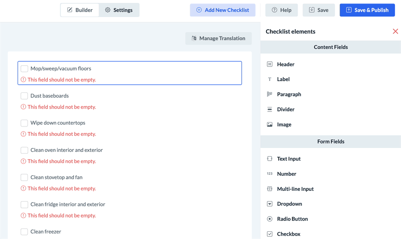
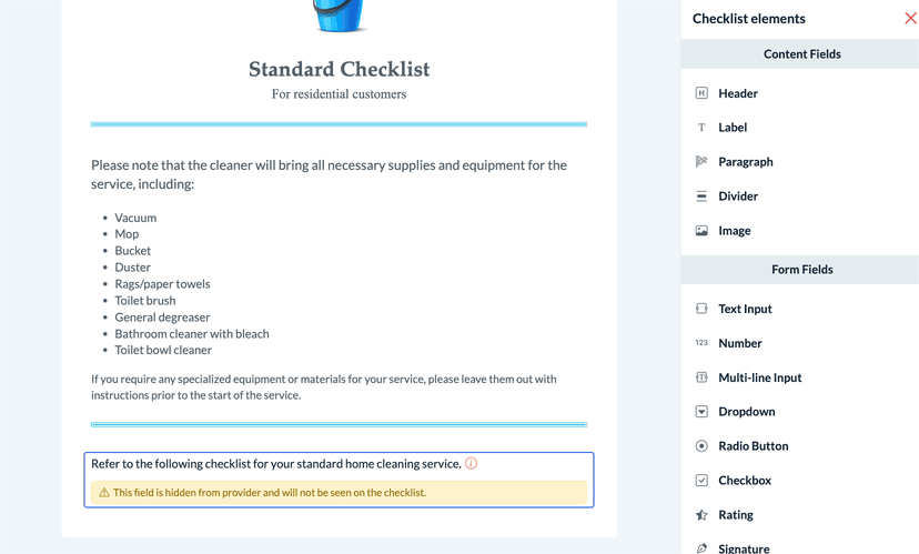
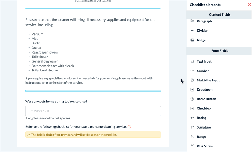
There are two types of checklist elements: "content fields" and "form fields".
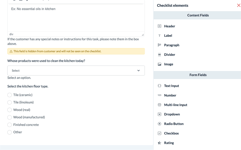
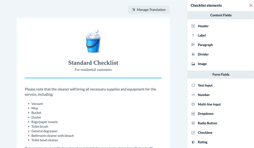
"Content fields" are non-interactive fields used to add instructions, explanations, and other formatting to the checklist. There are five different kinds of content fields:
Header - Insert a header and optional subheader
Label - Insert a "label" style line of text
Paragraph - Insert a "paragraph" style box of text
Divider - Insert a divider line
Image - Insert an image
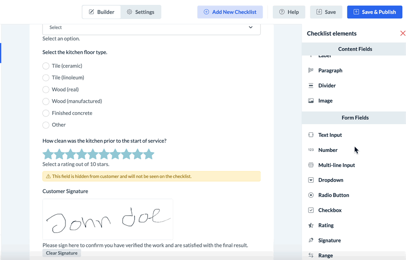
Form fields are interactive fields used to provide different ways of documenting and marking tasks as complete. There are ten different kinds of form fields:
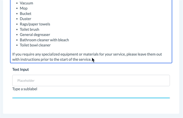
Text Input - Insert a small box for text input
Number - Insert a box for number input
Multi-Line Input - Insert a large, multi-line box for text input
Dropdown - Insert a drop-down menu with one or more options
Radio Button - Insert radio buttons (single selection of one or more options)
Checkbox -Insert checkbox(es) (select one or more options from multiple options)
Rating - Insert a "star-based" rating element
Signature - Insert a signature collection box
Range - Insert a "range bar" graphic
Plus/Minus - Insert a "plus/minus" box with buttons to increase or decrease the value.
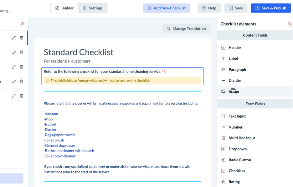
To add new fields to the form, click and drag them from the Checklist Elements menu on the right.
Whenever a new element is added, the content editor menu will open on the right side of the screen. This is where you can change the text and customize the content for each element.
For more detailed instructions on how to set up each checklist element and build your subtasks, please refer to the upcoming section, "Customizing Checklist Elements".
Change the Subtask Order
If your task has more than one subtask, you can change the subtask order by hovering over the checklist element to view the action buttons.
Hold the "Drag to Reorder" icon and drag the element up or down the page to place it in a new position.
A green system alert will appear in the top-right corner confirming that the subtask priority has been updated.
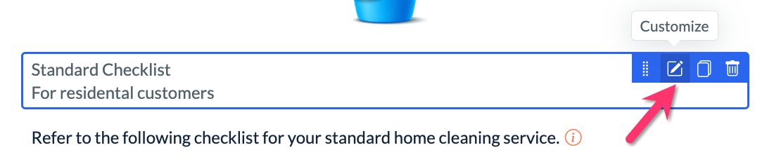
Customize, Duplicate, or Delete Subtasks
Click on the second action button, "Customize", to open the content editor and make changes to the element. Specific instructions on how to customize each type of element are detailed in the following section of this article.
The third action button, Duplicate, allows you to make a copy of the element you have selected. A pop-up window will appear asking if you are sure you would like to duplicate the element. Click the blue "Duplicate" button to proceed.
To delete an element, click the fourth action button, "Delete". A pop-up window will appear asking if you are sure you would like to delete the element. Click the blue "Delete" button to proceed.
A green system alert will appear in the top-right corner confirming that the element has been deleted.
Customizing Checklist Elements
Most checklist elements have similar settings and options to customize each subtask. However, some elements also have special settings that are unique to that element. The first section, "General Checklist Element Settings and Options", goes over more common settings found in checklist elements. The second section, "Specific Checklist Element Settings and Options", goes over specific elements including how more unique settings work.
General Checklist Element Settings and Options
Label
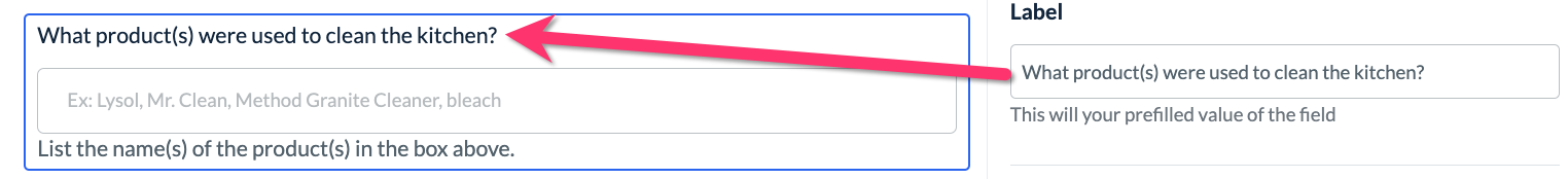
Whenever there is the option to enter text, the element menu will display a text editor box under where it says "Label". The label section can be used to ask a question or provide instructions, or it can be left empty if the text is not needed.
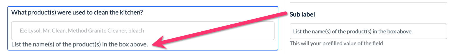
Optionally, you can also add a "Sub label" to most elements. This text will be displayed below the field.
Tooltip
Most elements include a "Tooltip" option. When enabled, the tooltip displays a custom message that appears when the cursor is placed over the tooltip info icon.
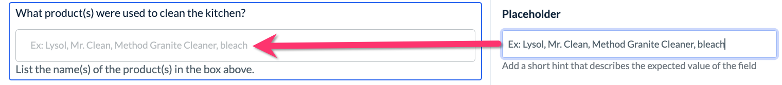
Placeholder
For any elements with a text input field, you can use the "Placeholder" option to provide an example or hint of what information you are looking for.
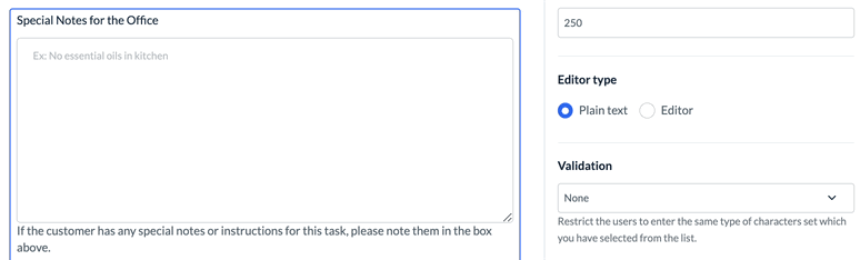
Validation
Text and multi-line input elements also contain "Validation" options that restrict the type of information that can be entered into the field.
None: No validation is required.
Alphabetic: Only letters of the alphabet can be entered into the field.
Numeric: Only numbers can be entered into the field.
Alphanumeric: Both letters and numbers can be entered into the field.
Email: Only a valid email address can be entered into the field.
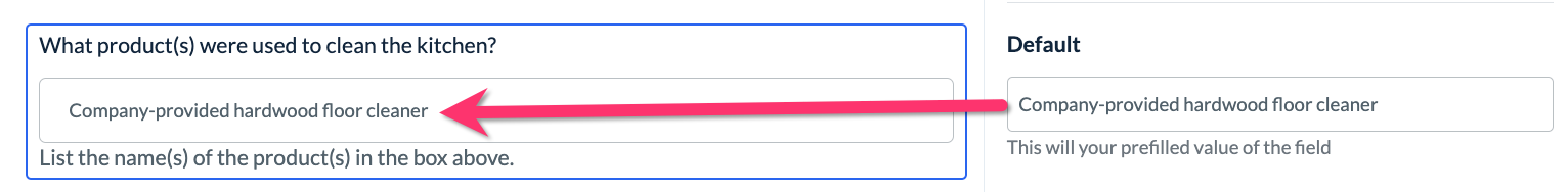
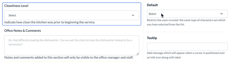
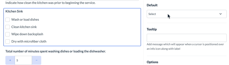
Default
Many elements will have a "Default" option to designate specific value(s) or add pre-filled content to a field. This value can be modified by the person completing the checklist.
Text-input elements allow you to add default text to the input box.
The dropdown menu and radio button elements allow for one option to be selected as the default.
The checklist element allows for one or more option(s) to be set as the default.
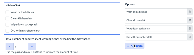
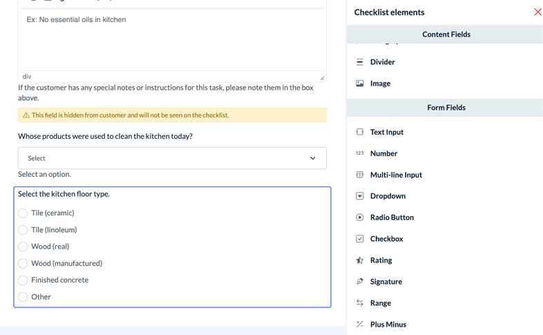
Options
To set up multiple options for the checkbox, radio button, or dropdown sections, click the blue "Add Option" button beneath the "Options" section.
Horizontal
Elements that allow for more than one option will also have a "Horizontal" option. When enabled, the horizontal option shortens an element's list of options by breaking them into two or more columns. The number of columns must be one less than the total number of options.
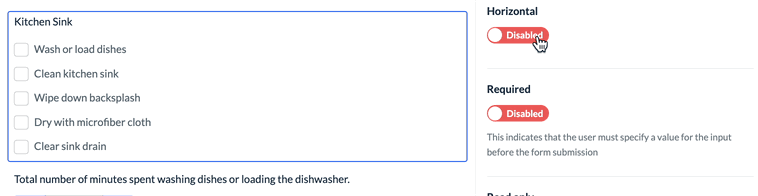
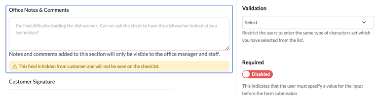
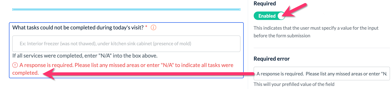
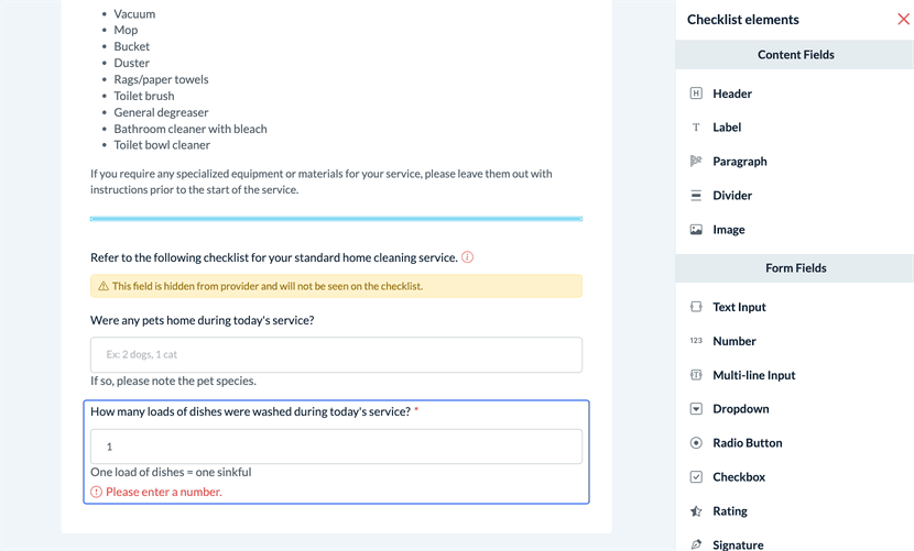
Required
If you would like to make a field mandatory, use the "Required" option and toggle it to Enabled. You can also enter a "Required error message" to display if users do not respond to mandatory fields.
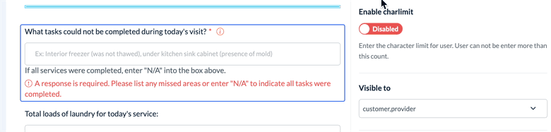
Enable Charlimit
For elements that permit text input, the "Enable Charlimit" (character limit) option limits how many characters the user can enter into the field.
Number-based elements allow you to set a minimum and maximum character limit.
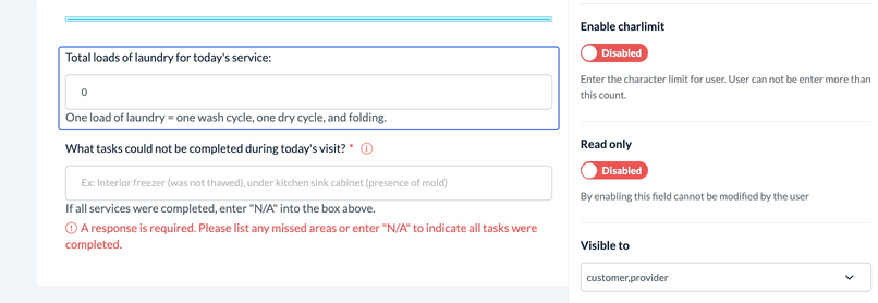
Text-based elements only contain the option for setting a maximum character limit.
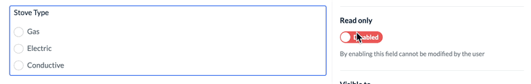
Read Only
Interactive elements have a "Read-only" option that prevents users from editing the field.
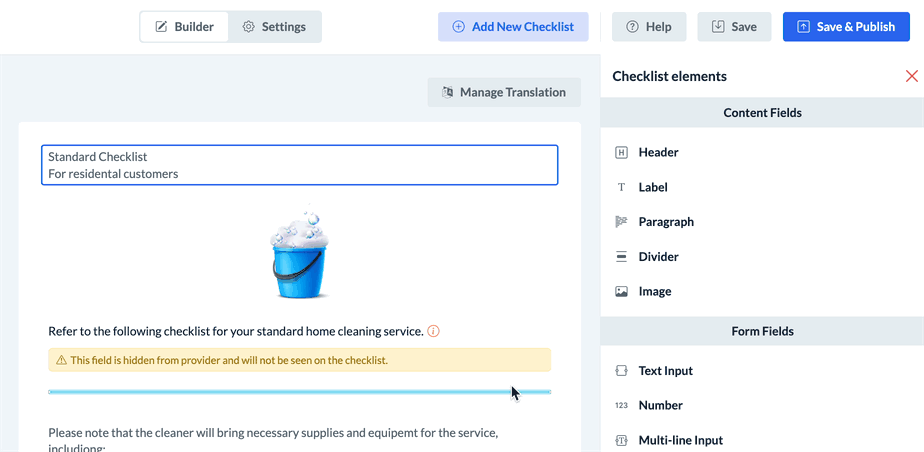
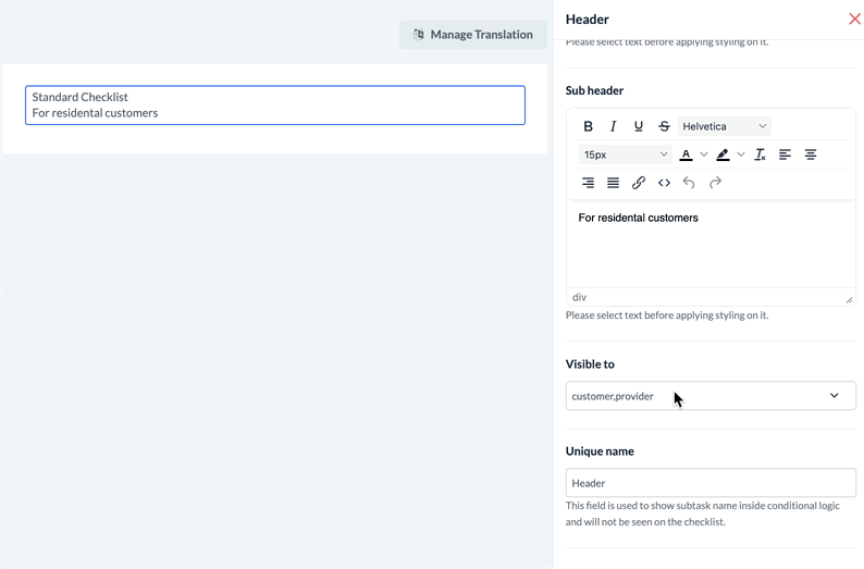
Visible To
The "Visible To" option allows you to specify if a field is visible to the customer, the provider, or neither. If a field is hidden from the customer and the provider, only the admin and staff will be able to see this element on the checklist.
Impact Progress Bar
Form elements have an "Impact Progress Bar" option that controls if the completion of the task/subtask will impact the checklist progress bar.
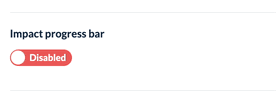
When this option is enabled, the checklist progress bar will increase when the task/subtask is completed.
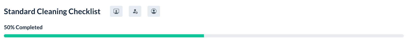
If this option is disabled, the checklist progress bar will not change if/when the task/subtask is completed.
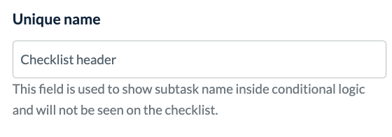
Unique Name
The "Unique name" field is used to label elements to set up conditional logic. The unique name is not visible on the checklist itself.
Conditional logic can be set up in the "Conditions" section on the Checklist Builder "Settings" page.
Click here to learn more about setting up checklist conditions.
Specific Checklist Element Settings and Options
Content Fields: Header
The "Header" element can be used to add a header (and optional sub-header) to the checklist.
To change the style of the header text, highlight the text with your cursor and then select one of the format buttons from the text box menu.
The "Header" element also has the following options available to enable or customize: "Visible To" and "Unique Name".
Content Fields: Label
The "Label" element can be used to add a shorter line of text to the checklist.
The "Label" element has the following options available to enable or customize: "Tool Tip", "Visible To", and "Unique Name".
Content Fields: Paragraph
The "Paragraph" element can be used to add a longer, paragraph-style section of text to the checklist.
To change the style of the paragraph text, highlight the text with your cursor and then select one of the format buttons from the text box menu.
The "Paragraph" element also has the following options available to enable or customize: "Visible To" and "Unique Name".
Content Fields: Divider
The "Divider" element can be used to add a stylized line between other checklist elements.
The Color section changes the divider's color.
The Style section changes the style of the line.
The Height section adjusts the thickness of the divider.
The Margin Top section edits the amount of space between the divider and the content above it
The Margin Button section edits the amount of space between the divider and the content below it
The "Divider" element also has the following options available to enable or customize: "Visible To" and "Unique Name".
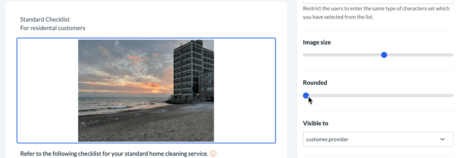
Content Fields: Image
The "Image" element can be used to add an image to the checklist.
Use the "Alt text" section to add alternative text to an image.
Alt text is used by screen reader technology for the visually impaired and is also indexed by search engines. In addition, alt text will be displayed on the page if the image does not load.
Use the "Link" section to add a hyperlink to the image.
Use the "Align" option to align the image to the left, right, or center of the page.
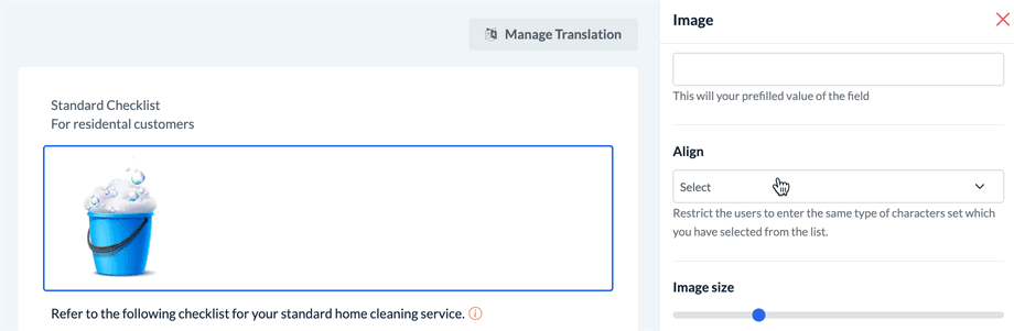
Use the "Image size" slider to adjust the size o the image.
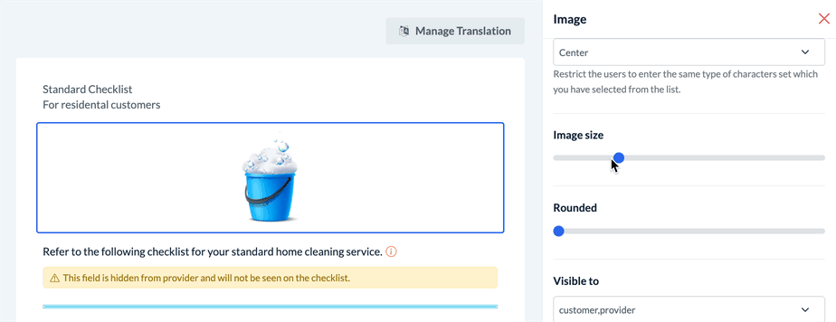
Rounded: This option allows you to round the edges of the image.
The "Image" element has the following options available to enable or customize: "Label", "Tooltip", "Visible To", and "Unique Name".
Form Fields: Text Input
The "Text Input" element can be used to add a shorter text-input field to the checklist.
The "Text Input" element has the following options available to enable or customize: "Label", "Sub Label", "Placeholder", "Default", "Tooltip", "Validation", "Required", "Enable char limit", "Visible To", and "Unique Name".
Form Fields: Number
The "Number" element can be used to add a number-input field to the checklist.
The "Number" element has the following options available to enable or customize: "Label", "Sub Label", "Placeholder", "Default", "Tooltip", "Required", "Enable char limit", "Read Only", "Visible To", and "Unique Name".
Form Fields: Multi-Line Input
The "Multi-line Input" element can be used to add a large, paragraph-style box for text input.
The "Height" option can be used to set the height of the text box in pixels.
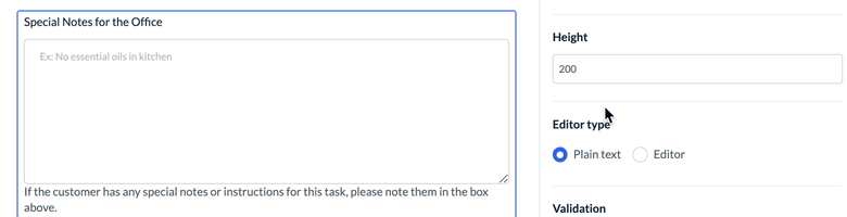
The "Editor Type" option can be used to change the text box type from "plain text" (text cannot be formatted) or "editor" (style and other formatting tools are available to the person completing the checklist).
The "Multi-Line Input" element also has the following options available to enable or customize: "Label", "Sub Label", "Placeholder", "Default", "Tooltip", "Validation", "Required", "Enable char limit", "Read Only", "Visible To", and "Unique Name".
Form Fields: Dropdown
The "Dropdown" element can be used to add a drop-down style menu with one or more options to select from.
The "Dropdown" element also has the following options available to enable or customize: "Label", "Sub Label", "Default", "Tooltip", "Options", "Required", "Read Only", "Visible To", "Impact Progress Bar", and "Unique Name".
Form Fields: Radio Button
The "Radio Button" element can be used to add a multiple-choice section that allows for only one option to be selected.
The "Radio Button" element also has the following options available to enable or customize: "Label", "Sub Label", "Default", "Tooltip", "Options", "Horizontal", "Required", "Read Only", "Visible To", "Impact Progress Bar", and "Unique Name".
Form Fields: Checkbox
The "Checkbox" element can be used to add one or more subtasks with a checkbox for each item.
Quickly add singular "Checkbox" elements for each subtask by utilizing the "duplicate" option. If the "Impact progress bar" option is enabled, the completion of each checkbox element will increase the progress bar.
You can also add multiple subtasks per checkbox element. If the "Impact progress bar" option is enabled, all subtasks within that "Checkbox" element must be completed before the progress bar is affected.
The "Checklist" element also has the following options available to enable or customize: "Label", "Sub Label", "Default", "Tooltip", "Options", "Horizontal", "Required", "Read Only", "Visible To", "Impact Progress Bar", and "Unique Name".
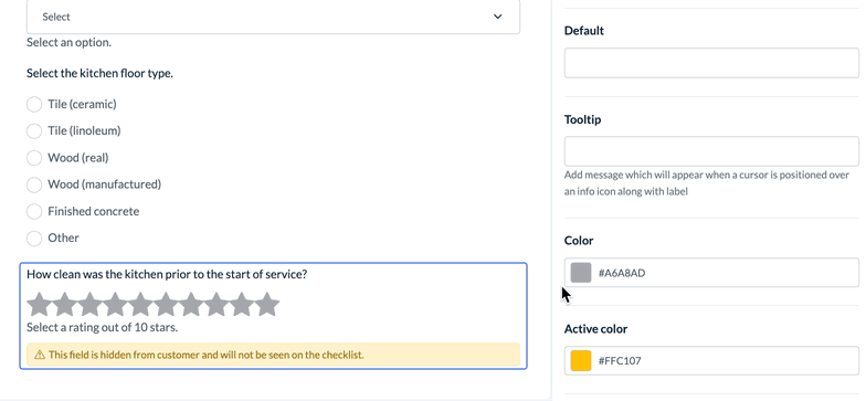
Form Fields: Rating
The "Rating" element can be used to add a rating per number of stars.
Use the "Color" option to set the unrated star color.
Use the "Active color" option to set the color of the stars that have been rated.
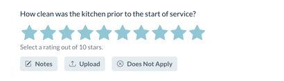
Use the "Rating size" option to set the size of the stars in pixels.
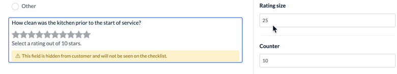
Use the "Counter" option to set the total number of stars displayed for this element.
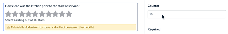
The "Rating" element also has the following options available to enable or customize: "Label", "Sub Label", "Default", "Tooltip", "Required", "Read Only", "Visible To", "Impact Progress Bar", and "Unique Name".
Form Fields: Signature
The "Signature" element can be used to collect a signature in the checklist.
The "Height" and "Width" options can be used to modify the size of the signature box in pixels.
The "Clear button text" option allows you to modify the "Clear" button that resets the signature box and allows the user to sign again.
The "Signature" element also has the following options available to enable or customize: "Label", "Sub Label", "Tooltip", "Required", "Visible To", "Impact Progress Bar", and "Unique Name".
Form Fields: Range
The "Range" element can be used to add a sliding bar that depicts a range of numerical options.
The "Minimum" and "Maximum" options are used to set the minimum and maximum values used in the range.
The "Range step" option sets the increments used for the range.
For example: If the range's minimum is "1", the maximum is "5", and the "range step" is "1", the checklist user can move the slider to select 1, 2, 3, 4, or 5.
Another example: If the range's minimum is "1", the maximum is "5", and the "range step" is ".5", the checklist user can move the slider to select 1, 1.5, 2, 2.5, 3, 3.5, 4, 4.5, or 5.
The "Range" element also has the following options available to enable or customize: "Label", "Sub Label", "Default", "Tooltip", "Required", "Visible To", "Impact Progress Bar", and "Unique Name".
Form Fields: Plus Minus
The "Plus Minus" element can be used to add a number field with plus and minus buttons to increase or decreased the starting value.
The "Range" element has the following options available to enable or customize: "Label", "Sub Label", "Default", "Tooltip", "Required", "Ready Only", "Visible To", "Impact Progress Bar", and "Unique Name".
Save and Publish
Once you've finished making changes, please remember to click the "Save & Publish" button to push the changes live, or use the "Save" button if you only want to save the changes in the Checklist Builder.
To exit the checklist builder and return to the checklist listing, click the back arrow at the top left corner of the page.
Next Steps
After creating a new checklist and adding tasks/subtasks to the list, you should review and set your preferences in the checklist's "Settings" tab. The Settings tab is located just to the right of the Builder tab at the top of the Checklist Builder page.

There are four sections under the checklist Settings tab: Settings, Dependencies, Conditions, and Tags.
Click here to learn how to enable and customize checklist settings in the "Settings" section.
Click here to learn how to use the "Dependencies" section to set up checklists for different job types or combinations of services.
Click here to learn how to display or hide certain tasks/subtasks using conditional logic in the "Conditions" section.
Click here to learn how to set up and manage checklist tags under the "Tags" section.